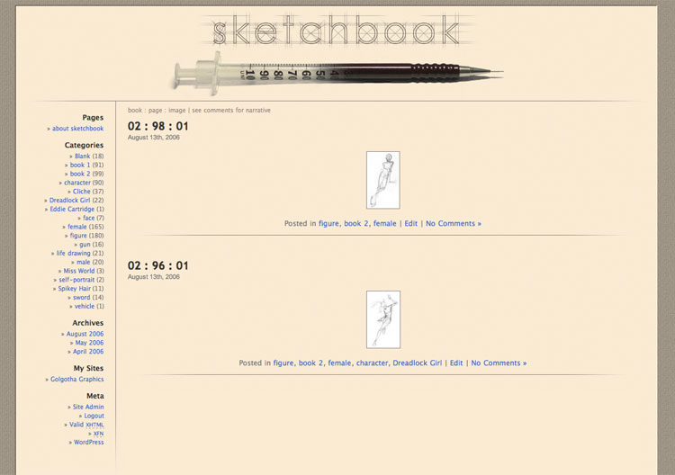
 My sketchbook. An early WordPress theme attempt, based on categorising character sketches from a number of sketchbooks.
The best part of it is the header graphic, which I’m still a huge fan of today.
artist
My sketchbook. An early WordPress theme attempt, based on categorising character sketches from a number of sketchbooks.
The best part of it is the header graphic, which I’m still a huge fan of today.
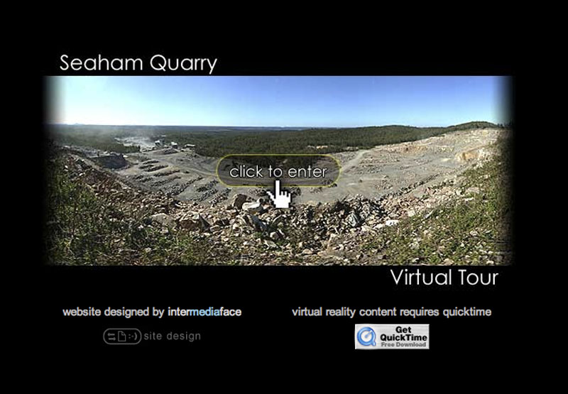 This is the most recent of the Virtual Tours I’ve done for the NSW Minerals council. These sites are use as a part of their educational outreach program (don’t get me started on the “ethics” of working with the mining industry – our entire society depends on processing raw materials). Unfortunately these sites are all in need of some maintenance, since there were a lot of tricks (now obsolete) required to protect the quicktime content from being hijacked by windows media player, which couldn’t play it correctly.
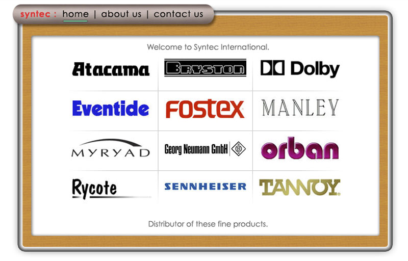 This client distributed high end audio products, so the design theme chosen was metal and wood. Again, I think it’s a beautiful and serene design, that has some nice simple iconography, with a strong corner oriented placement.
Keeping the home page as the central product hub makes the navigational topography very clean.
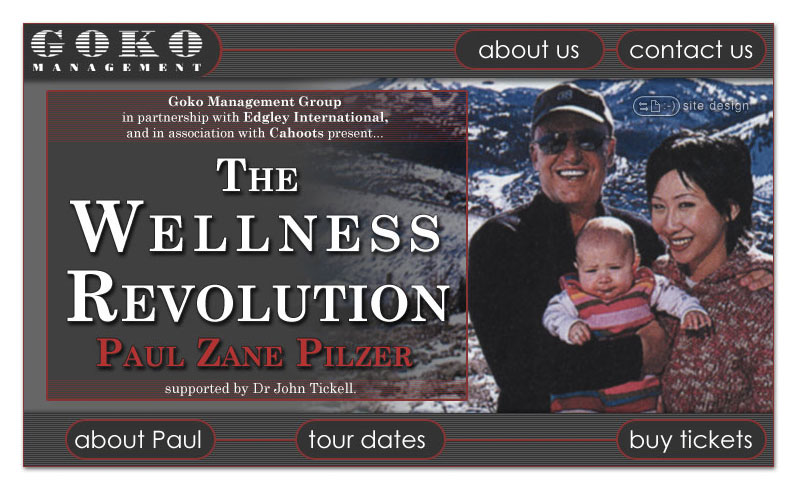 This is the first design I produced for this client. It was intended to be a promotion for a motivational speaker they were bringing out. Sadly it suffers from photos that weren’t of the best quality. It only lasted online for about a week however, before I was asked to completely redesign and repurpose it to be more company-centric.
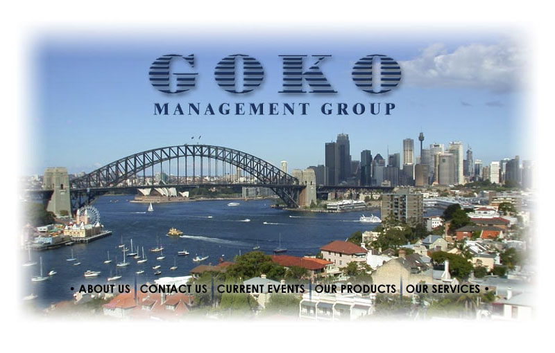
 This was a somewhat frustrating design, in that it started out salvaging another design that was abandoned about a week after it went live. Not that there was anything wrong with the design, the client had a change in business relationships, so their site was redirected to promote them exclusively. You can also see an image gallery of the variations the site went through, which to my eye, all looked nicer than what eventually went live.
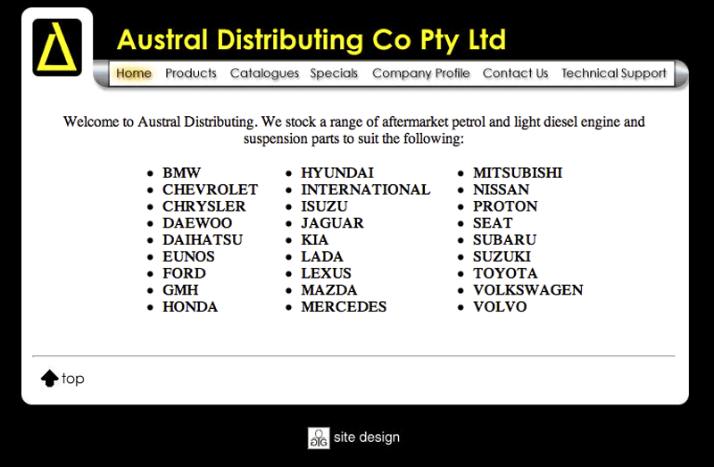 This is a very old site, predating my use of CSS for typography. I still like it for the design itself though, especially the “products” page.
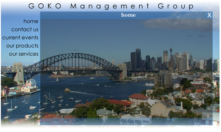
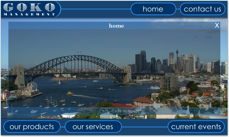
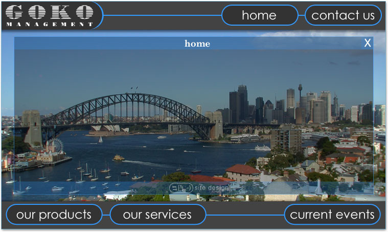
Even by today’s standards, it’s got that “web 2.0”-ish look to it, rounded corners and all. Really, all it needs is a bunch of superfluous reflections, and to be missing a few vowells from the name.
 This site was done quite a while ago, but I think it stands up quite well. It was still in use many years later, which is sortof the point – to make a good design in the first place that doesn’t have to be updated and changed with fashion year after year.
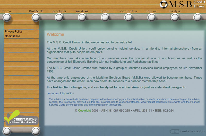 The Maritime Services Board Credit Union site. Hence, the general wharf / jetty theme.
Sadly this site barely made it online before they merged with another credit union and it was mothballed. Once you go into the “products” section it has a really nifty animated menu system. This site also has a completely liquid design, able to resize to any browser window.
It’s a product of its era, in which frames was the only technology that could accomplish the design. Today, a simple CSS technique would achieve the same result.
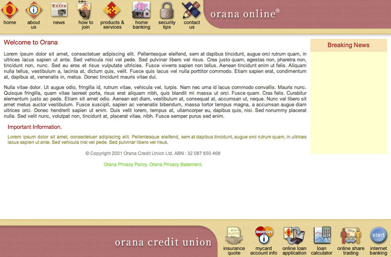 This design was created for Orana Credit Union. Many years later, I still think it’s a beautifully elegant layout, with the vertically and horizontally opposed icons for primary navigation. The bottom ones are all verb enablers, leading to functions, whereas those on the top are for informational division
The entire design scales to any browser size, and the yellow space on the home page was an adjustable post-it note space for quick news pieces etc. It’s a frames based site, which I wouldn’t do these days, but given when the design was done, that was the sanest technology choice.
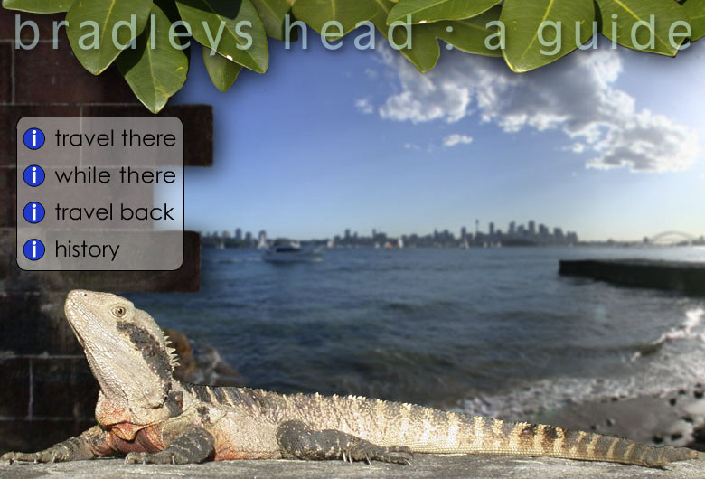 This was a student project from an instructional design class. It uses html, flash, & quicktime to deliver a rich-media tourist guide experience.
Yes, the voiceover is cheesy.