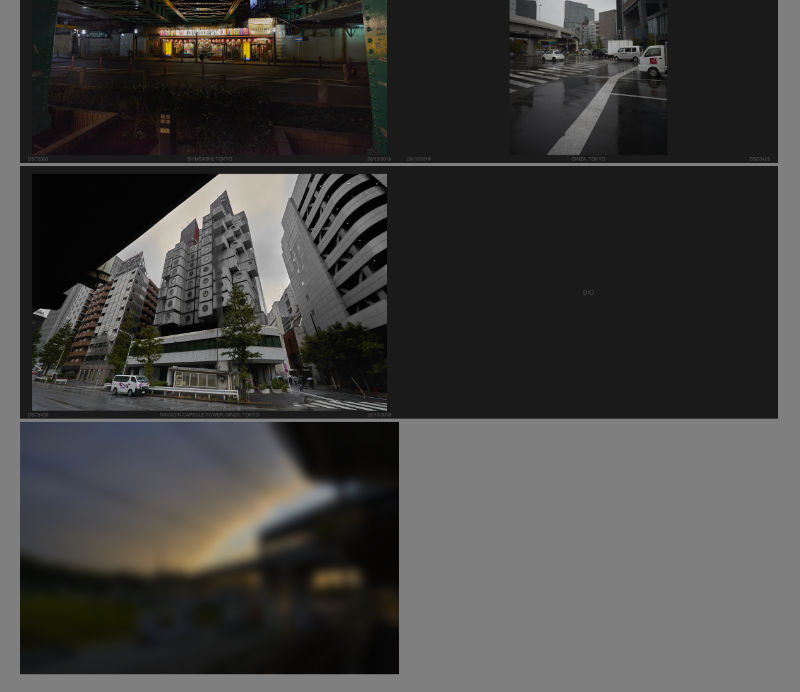
One of the issues with the EPUB workflow, is that EPUB documents are .zip compressed. This makes proofing & previewing while you’re working problematic, as some reading apps can’t deal with uncompressed documents. With Apple’s deprecation of EPUB authoring and proofing support:
…proofing on an iPad became a pain point that made the work simply not fun to do.
I’ve been thinking about a solution to this on and off for a while now, and a solution hit me that has obviously been percolating up for a while.
Use iFrames.

I don’t know why I didn’t think of this sooner, but the solution is at once clever, and so straightforward it makes me feel stupid for having not seen it earlier.
What you do, is set up the entire document of facing pages using an iFrame for each page, and then set the iFrame sources to the xhtml files inside your EPUB development directory.
Thus the HTML:
<!DOCTYPE html>
<html>
<head>
 <title>The Title</title>
 <link rel="stylesheet" href="styles.css">
</head>
<body>
 <div id="the_container">
  <div class="spread rightonly">
   <iframe src="path-to-your-dev.epub/OEBPS/cover.xhtml"></iframe>
  </div>
  <div class="spread doublepage">
   <iframe src="path-to-your-dev.epub/OEBPS/inside_front-cover.xhtml"></iframe>
   <iframe src="path-to-your-dev.epub/OEBPS/page_001.xhtml"></iframe>
  </div>

  ...

  <div class="spread doublepage">
   <iframe src="path-to-your-dev.epub/OEBPS/page_120.xhtml"></iframe>
   <iframe src="path-to-your-dev.epub/OEBPS/inside_back-cover.xhtml"></iframe>
  </div>
  <div class="spread leftonly">
   <iframe src="path-to-your-dev.epub/OEBPS/back-cover.xhtml"></iframe>
  </div>
 </div>
</body>
</html>
And then the CSS:
html, body {
 margin: 0;
 padding: 0;
}

body {
 background-color: gray;
 transform: scale(0.5); /* set the zoom degree to view */
 transform-origin: 50% 0; /* centres the zoom in the middle of the browser */
}

iframe { /* the width and height of the EPUB's declared viewport */
 border: 0;
 width: 1200px;
 height: 800px;
 margin: 0;
 padding: 0;
}

#the_container {
 width: 2400px; /* double your EPUB's viewport width */
 min-width: 2400px;
 margin-right: auto;
 margin-left: auto;
}

#the_container div {
 margin-top: 10px;
 margin-bottom: 10px;
}

.spread {
 width: 100%;
 display: flex;
}

.rightonly {
 flex-direction: row-reverse;
}

.doublepage, .leftonly {
 flex-direction: row;
}
The nifty thing is the transform scale and origin in the body tag’s CSS, so you can scale the whole thing down if the spread won’t fit in your display’s available space, or if you want a more document-wide overview.
Enjoy.
If this article was of use, a donation or buying something would help support my projects.
