Introduction.
“Poor artists copy, great artists steal”
This quote, in various forms, including the less judgemental “Immature artists copy, developed artists steal”, has been (mis)attributed to many artists throughout history. It expresses a fundamental truth within any artist’s practice – that all technique is learned through imitation, but that imitation is only the first part of the process.
The difference between copied and stolen techniques comes down, in my opinion, to understanding not only the how (copying), but more importantly the why of a technique. To steal in art, is to take an idea, and be able to pull it apart and rework it to suit your own needs, without breaking the things that made the idea valid in the first place.
What does this have to do with comics? Well, comics is an artform which is not only built upon copying – witness the plethora of “how to draw (style) comics” manuals, but is also practiced, frequently, by people who are not formally trained as artists. In my experience, academic training is where the why mindset is nurtured.
This brings us to the point – the often misunderstood theory of panel design, especially as it relates to Manga, and most especially as it relates to Manga-style comics produced by westerners.
In western comics, the order in which panels on a page are read is often expressed along the lines of “left to right, then down”, sometimes with the addition of a “look at what’s happening in the panels if there’s any confusion”.
In the world of western languages, this may seem self-evident, after all, western scripts are universally(?) written in a left-to-right horizontal direction. Given the popularity of Manga, and the number of westerners for whom the graphical style of Manga is the dominant influence, this requires a deeper consideration. Unlike western scripts, Japanese is written from right-to-left, and may be either horizontally or vertically aligned. When a western, english language “manga artist” tells you the rule is “top right to bottom left, and always horizontal before vertical”, it becomes apparent that there are some fundamental misunderstandings about the design theory behind Manga amongst western practitioners.
Left to right or right to left?
When published in Japanese, Manga employs a right-to-left reading order, and broadly a top right to bottom left page reading direction. This is obviously the opposite of the way a western book is laid out and typeset. Japanese books are read right-to-left, because the Japanese language is written right-to-left. Starting in the origin corner of the page, the text you read progresses in the same direction as the overall page. Likewise, western comics, and western languages are written and read in the same direction.
When Manga were first translated and released to western audiences in the 1980s, publishers like Eclipse Comics, and translators like Studio Proteus would mirror-image flip the pages, so they could be read left-to-right. This also required subtle re-writes of the script, to ensure that spatial references (characters noting on which side an eye-patch restricts vision, for example) are updated. In the 2000s a counter-trend emerged, of translating text, but not flipping pages. This often extended to not translating or retouching the sound effect text, and was claimed to be in aid of producing a more “authentic” translation of the original. A cynic, or perhaps a realist, might suggest that it’s a bit convenient for “authentic” to coincide with “less work” and “cheaper”, especially when it produces a product that reduces the ease with which the reader can access the work.
Mirror-flipped or not, however, remains a controversy for translated Manga. When it comes to Manga-esque comics written in english, or any other left-to-right script, there should be no controversy – your comic should be read in the same direction as your language. Yet, as I mentioned earlier, there seems to be a (sub)culture of creating right-to-left Manga-styled books amongst western comics artists.
This is a perfect example of the copying vs stealing dichotomy: The immature artist copies the right-to-left reading order because that’s what Japanese language Manga does, the developed artist steals the design methodology, and understands that the reading direction is a function of that language in which it’s written, and is a means to the end of communicating the story, not an end in of itself.
“Authentic” Manga.
I’ve seen a defence of using right-to-left direction for english language Manga-like comics expressed along the lines of claims to authenticity – that Japanese Manga is right-to-left, so doing western Manga-style comics right-to-left is more “authentic”, and presumably, more correct.
This is where we get into the fraught world of cultural appropriation (and potentially identity politics) – where is the line drawn between adopting elements of the style of another culture’s art, and attempting to pass oneself off as an “authentic” practitioner of another culture’s art? Manga itself is a result of the traditions of Japanese drawing encountering Disney’s cartoons during the postwar occupation of Japan by American troops. The big eyes, the animation style – that’s yet another example of stealing in the artistic sense. Something from one culture was so thoroughly adopted and coopted by another, that it is now synonymous with the thief.
What’s happening with Manga produced by westerners is often not that, however. If you’re a westerner, you’re not an “authentic” Manga artist. What you produce will never be “authentic” Manga. A white Australian could learn everything there is to know about Aboriginal art techniques, learn the cultural stories, live with local Aboriginal groups – they will never be able to sustain a challenge to the authenticity of calling themselves “Aboriginal Artists”. In the Aboriginal case there’s also post-colonial and socio-economic outrages involved – so not to suggest that these two analogies are of equal severity, merely that they are structurally equivalent.
We have a long and sordid history of white artists passing themselves off with fake Aboriginal names in Australia, and this is the thing with authenticity – it derives from the artist, not the art.
Get to the point!
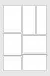
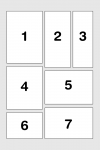
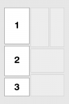
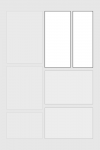
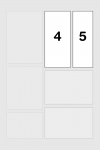
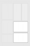
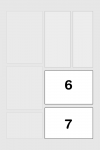
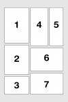
What is the actual theory behind panel layout in Manga? Here it is, in it’s simplest form:
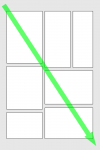
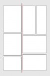
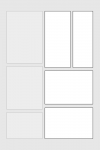
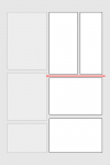
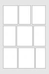
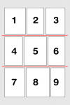
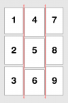
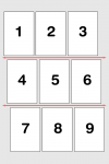
Scanning from Origin to Destination (top left to bottom right for western script, horizontally flipped for Japanese), find the first edge-to-edge gutter, and divide the page. Repeat recursively.
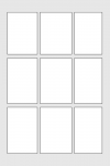
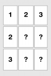
(Note: yes I appreciate the irony of a grid layout here, given my thesis is about the problems of grid layouts – read across then down.)
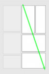
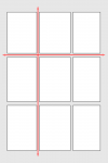
The Manga layout formula is inherent to the design. It’s a hierarchical rule, built on a consistent internal logic, independent of, and adaptable to any language. What this means, and what is a defining characteristic of Manga panel design, is that grid layouts, where edge-to-edge gutters intersect, are rare / forbidden.
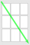
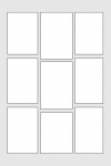
Grid layouts are claimed to “work” (and I would argue they don’t actually work) in western comics because western script is always horizontal – it’s always across before down. That’s a problem as far as I’m concerned – the “rule” isn’t inherent to the design, it’s imposed from an external set of knowledge. Without the content of the panels, and without knowing that the language was written horizontally, there is nothing in the way western comics are designed which reveals the correct panel order.
It is only the fact that people in western society are raised in a horizontal text culture, that makes the idea of “horizontal before vertical” seem like a natural, intuitive rule. Worse still, most people who would argue for grid layouts have probably been reading comics for so long, that they are unaware of having internalised that arbitrary rule.
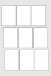
“I want equal sized panels to communicate the experience of equally spaced, equal-length moments in time.”
Ok, try this:
But what about an artist’s personal vision? What if an artist really likes the symmetry of the grid? Why should an artist follow these rules?
At the end of the day, a comic page is about communicating the events depicted in the panels. That is the ultimate goal. A panel layout is the user interface for that goal, and when the artist’s personal desire for aesthetic expression conflicts with clear, unambiguous readability, it is their responsibility to get over themselves, and put the reader first.

