gatehouse 1

One of the gatehouses for Petersham water reservoir. I love the fact that old-timey utilitarian public infrastructure has such decorative architectural details.

This pic was shot on film, and hand printed. The sky was originally blown out and white, so a bit of hand burning was required (exposing the area to be burned for longer, so it darkens).

water tank

The Petersham water reservoir. It looms over the suburb like a fighting machine from War Of The Worlds. There’s something very physical about the grainyness of black & white film, and it kindof has this interesting flatness because of the highish depth of field.

I’d like to empty it out and convert it into a house. The tank itself is over three stories tall.

etherwoman

This content requires HTML5/CSS3, WebGL, or Adobe Flash Player Version 9 or higher.

This is a first year college piece modelled from a lifemodel.

It is constructed of steel and ethernet cable in continuous lengths from foot to foot.

Dimensions h,w,d: 100, 55, 20cm

fairy

This is a small piece while I experiment with new styles. It’s graphite pencil and watercolour pencil.

obscured(,) translating gods

obscured(,) translating godsBelieve it or not, this is a still life sketch. The brief for this piece was to completely cover a large sheet of paper in very small marks to create a background texture field. I went and scrawled over the whole thing in a faux asian syle script, which wasn’t strictly the idea, but hey, I liked doing it.

From there we were drawing a selection of pacific islander art, statues etc, but just taking a narrow angle section of the arrangement. It was all going ok, but while the left side was working out really well, the middle to right was a bit empty and meh. The teacher suggested covering it, and so with giddy abandon, I obliterated a huge amount of work with that big black rectangle. The theory behind this, as far as I can see, is that the remaining areas are made all the more precious by the wanton destruction of the work in the covered section.

addict’s whore goddess

Well, this was my personal apocalypse piece for the year. Done in the same drawing subject as the St Mary’s piece, I obsessed over this work from the time I woke, until I fell asleep. What I wanted to get to was the, well, horror and revulsion these trees evoke, combined with the overt sexuality of their forms. I imagined (yeah imagined *cough* – hey look over there) what they must be like to someone under the influence of any number of substances, illicit or otherwise, and tried to conjure up this screaming, commanding monster of a deity, all demanding, and all consuming. It helps to keep in mind the park this tree occupies is frequented by junkies.

When I first showed it to the teacher, his answer was “Yeah, it’s very illustrative, like a cover for a horror story”. I guess people can only judge things by their own experience.

mayfly cycle

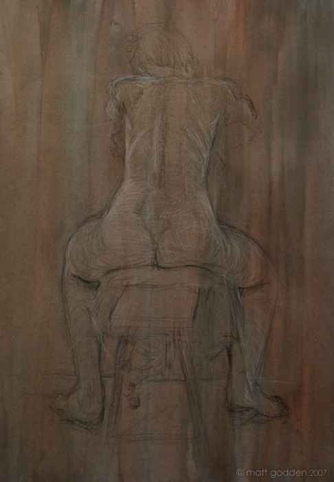
These works were the core of a project based around using computers in art. Now, as someone who works digitally a lot of the time, I actually think they’re a terrible artistic tool since the crutch of “undo” robs people of any risk while creating works. Never having to risk destroying a work to progress it, I think is going to create risk-averse artists. But that’s a rant for another time.

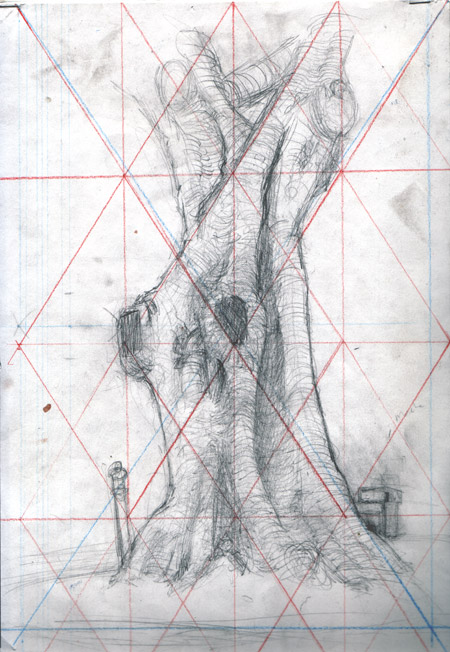
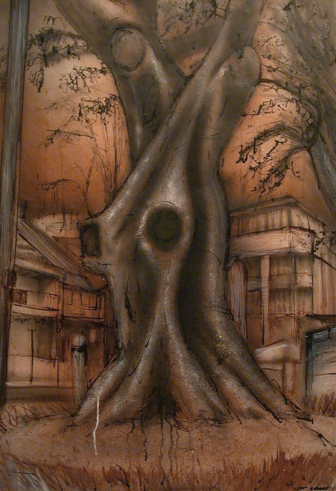
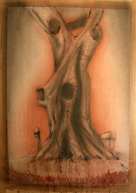
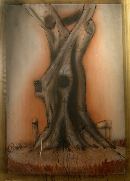
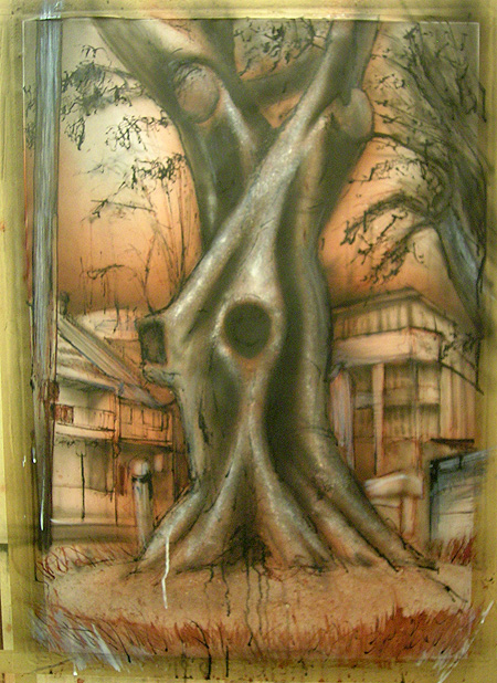
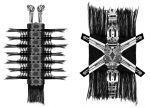
The basic premise was to scan some real world objects, and combine those with scans of our sketches done of the machine part templates, and then use photoshop to composite the parts. I ended up scanning my scarf, and watch. Some of these digital pieces were combined with crayon drawn on acetate overlays, but the final product was to take them and retranslate to a charcoal drawing.

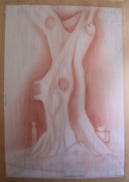
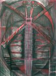
This second piece was begun by covering the entire sheet in charcoal and compressed charcoal marks, then begin cutting the image out with an eraser, then go back in with charcoal and pastel, over and over building up a depth of texture to get to a dense image.

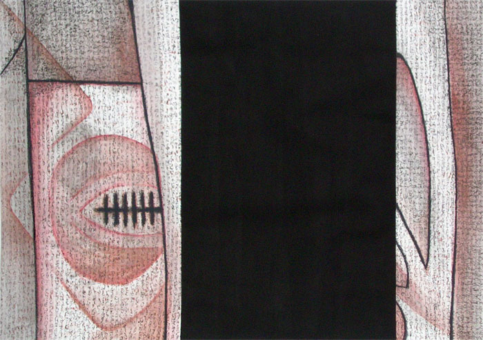
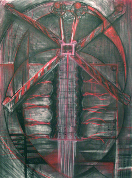
The bits of text on it are sequences of random numbers, done with one of those adjustable rubber stamps. And when I say random numbers, I was in the studio with my laptop running a random number generator. Hit the button to generate the number, adjust each digit on the stamp, ink, stamp, hit the button again. Very laborious, but a really satisfying result. This is one of my favourite pieces of 2007. It’s a little under A1 in size.

lifemodel on a donkey

This was from a life drawing class, and was one of my early uses of black and white on pre-stained paper. I think the volumetric modelling on the lower back ended up working really well, and the fading detail through the head provides some depth. I’ll try to get some more life pieces up over time. They’re A1 in size, and stained with a combination of burned sienna and black washes.

st. mary’s cathedral

This was done on the basis of sketching at St Mary’s cathedral in Sydney. The initial sketching was somewhat amusing. I was sitting in a corner on the floor drawing away, and an old lady brought a tour group of private school boys past (I’m there in boots, dreadlocks and tartan pants) and she comments “now we won’t disturb the artist there” and then proceeds to explain some chapel I’m sitting next to. I looked around for a sec for this “the artist” before I realised se meant me. Kinda made my day, actually.

So, the big finished work is A0 in size, and was scaled up by hand using diagonal quadrants. It’s done in a combination of burned sienna and black ink, and I think is the beginning of my love affair with these to colours. There’s also some wax resist in there, where you draw with wax on the paper to repel ink from parts. Overall I think it’s strength is the layers of contrast which draw the eye through the piece, the virtual silhouetting of the foreground, the somewhat dreamy loose midground, and then he deep shadows heading off into the transept. Hopefully you get a feeling for the almost forest nature of the gloom and columns.

orange still life

One of two quick and dirty A3 portfolio stuffers done prior to assessment at midyear for the Table project. It’s a still life, based on the same object used for the flying pieces in the cityscape. What’s remarkable is how evocative the orange feels of Aboriginal / central Australian colours – it was commented on by a number of people.

I may very well work on some more variations on this piece, since I really like the way the tall extensions almost seem extruded from the substance on the ground plane. Viewed upside-down it looks like they’re dripping down.