Matt Godden

human : artist

Bring content into view.

Category : art

2d, 3d, Digital, Analog.

cityscape still life

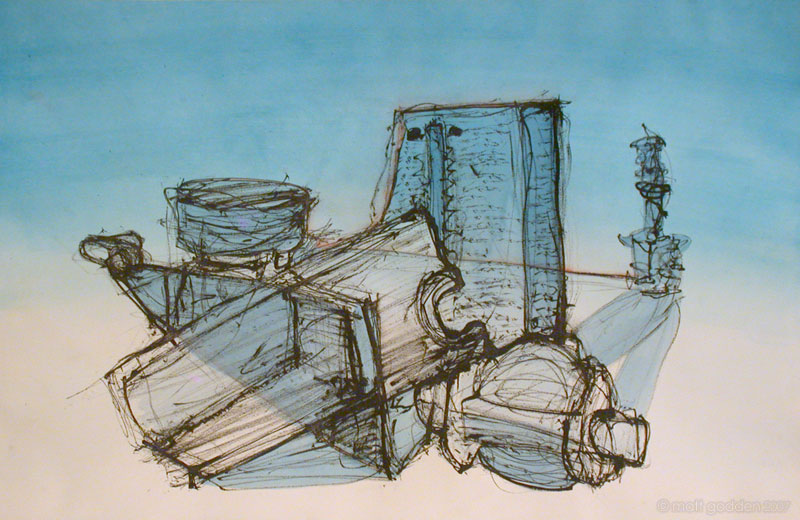
This was the second Table piece, again based on sketches of the machine part templates. It’s another piece around A2 in size. The background stain was done over a few days, building up colour after colour. On an aside, these watercolour pieces aren’t a perfect reflection of the actual works – watercolour has an amazing variability depending on the lighting conditions it’s being viewed under, mainly due to the mechanics of light refraction and reflection within the layers of paint. You really need to see them under true sunlight, the downside being sunlight degrades the pigments eventually.

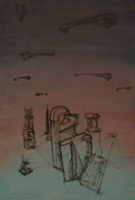
The actual idea with this was to mess with scale and try to work very small, so having filled the bottom, knowing what to do for the top was a bit of a mystery. The long bone-like template came to the rescue, and so it ended up being reminiscent of a steampunk type vista of airships over a city.


blue still life

This was my first work in our table series of drawings. The objects were wooden positive templates for producing moulds of machine parts.

The A2 sized piece is on watercolour paper which was stained with the blue watercolour paint, then the drawing was done using a skewer dipped in ink, and applied right-handed (I’m a lefty). I’m happy with the small touches of red, and the blue areas that break the shapes with multiple overlaid perspective. An important lesson in this piece was using a broken and frayed skewer, and rolling it while advancing perpendicular to the roll to apply a line texture over and over, sortof like repeated stencilling.


red flag collage

Produced for the collage project. I wanted to try working big on this one, so it’s around A0 size.

The very first rough planning versions had the central black box and strips offset slightly higher of centre. I brought it back to centre for a sense of symmetry, but looking back at photos, I really prefer the off-centre version. I see why my drawing teacher used to keep telling me symmetry was something of which to be wary.


three panel collage

This was produced as a part of the collage project we did at college, and was actually a recycling effort for paper staining that was done for a failed piece.

Each panel is a little under A4 in size.


surrender

This poster was produced for the 2007 Sydney Supanova convention. I was a tad uneasy about this one, since it deviated from the thematic elements I’d preferred – angry female characters wielding blunt objects. Still, I’d had a few people asking for images that were less in that direction, a couple specifically asking for some sort of “cyber chick”, and thus, this image. I think this one worked worked really well from a volumetric perspective, and the character has quite a different body type from the other two, far more solid (to my eye, at least).

What I like most about this one is the compositional alignment of the cog with the knees and shoulders.

This image was printed by our new printer and is even more lustrous than the others. Again, it’s a limited run of 50, on 200gsm stock, A3 size and available from the store.


cliche

This is the most popular of the poster images I’ve created, and was done in tandem with Blank for the Sydney Supanova convention in late 2006. The character shown here may or may not make an appearance in the sequel to Surfing The Deathline, Nations.

The initial designs for the character date to 2002 when I was studying animation, during which I created a walk cycle animation of her. During a break from Surfing The Deathline I revived her for a sort of fantasy project, based around the idea of exploring queue rage – hence the name “Cliche”. As I rediscovered my enthusiasm for Surfing The Deathline I shelved the project, but who knows I may still pursue it.

Like Blank, this was a limited printrun of 50, signed and numbered. It’s printed on 200gsm stock, and A3 in size. There’s less than 10 remaining, so if you like it, go visit the store – they tend to sell pretty quickly when I do an event.


blank

Everyone loves a girl with a shaven head, boots and a big freaking spanner.

And if you don’t, well, best say you do and avoid a spannering.

This image features the character “Blank” from Surfing The Deathline (free stuff to the first person to correctly identify the origin / reference of her name). I think as an image this is the best of the posters, mainly for the sense of weight and inertia the character carries to one side, balanced by the cog wheel.

Fun fact: the rusty metal surface of the cog is a photo of my coffee table.

The poster of this image is A3 size and printed in full colour on 200gsm stock. It’s a limited signed and numbered printrun of 50 only, and they’re available from the Golgotha store.