F-Stop Lotus (2015) Unboxing & First Impressions

Only the truly damned can know the suffering of those, for whom the perfect camera bag is a white whale obsession. Too big, too small, the wrong access, no hydration – we mutter this to ourselves, as those who love us climb the widow’s walk of Gear Acquisition Syndrome, and curse the sea for its cruel humour, for not just taking us and ending the pain.

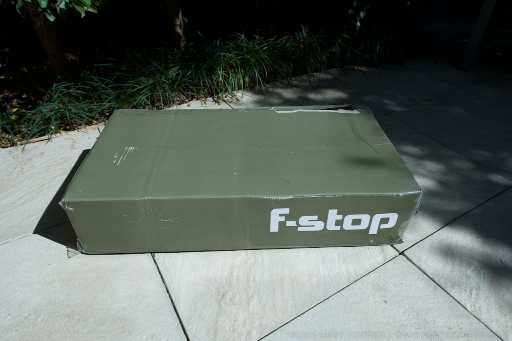
Yes, buying a camera bag can be a fraught experience. This isn’t helped by the fact that the subject of this first look must be making its bags out of unicorn skin, with chickenteeth zippers, such is their rarity in retail outlets. I’ve just taken delivery of one of the first production run of the (now sold out) new F-Stop Lotus bags, so here’s an unboxing and first look.

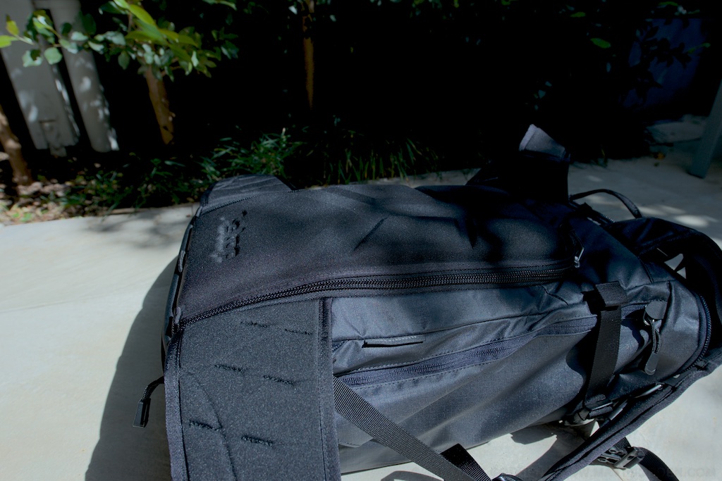
Quick statistics – the Lotus is the smallest of F-Stop’s Mountain series packs. It’s a 32 litre shell with one main compartment, and side, front and top-of-lid compartments. Why would you get it? In my case – it’s compact enough to be a large daybag / everyday carry (with camera), but has a harness and numerous external attachment points, to enable it to be loaded up for lightweight overnighting.

Unboxing

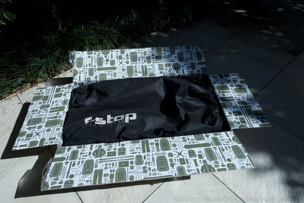
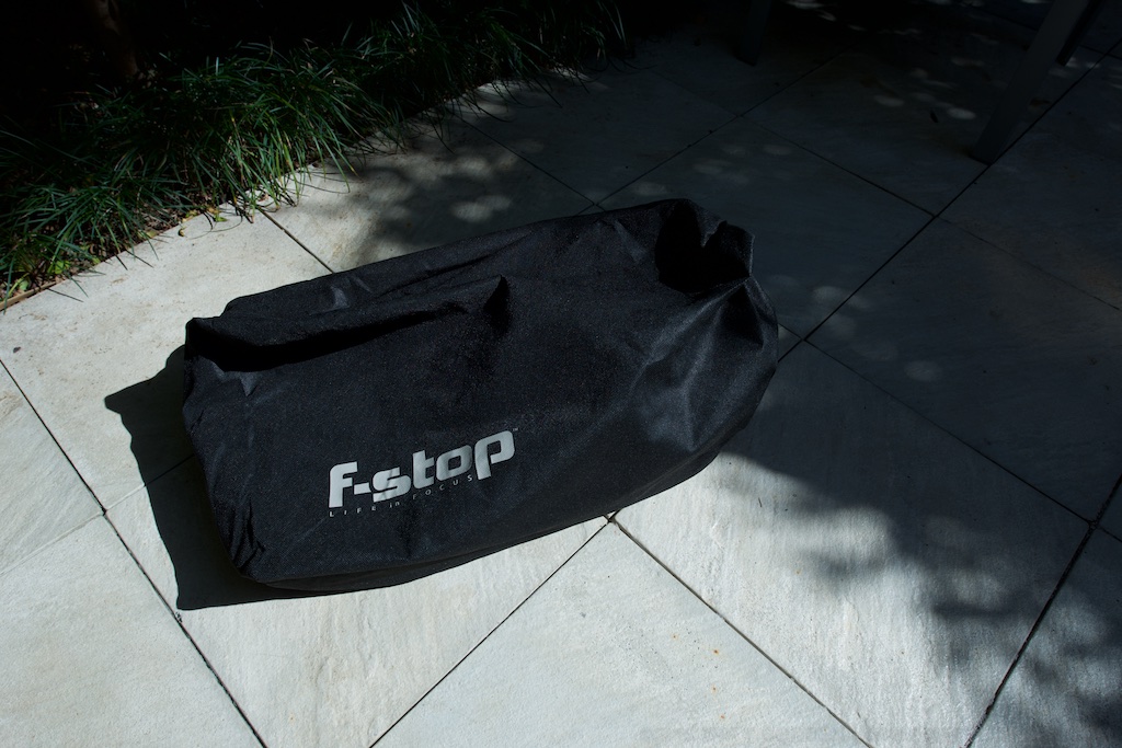
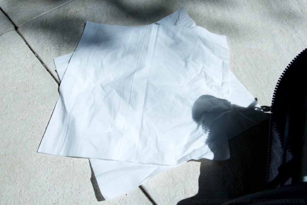
The purchasing experience was, well, it was ordered & paid for on F-Stop’s website in late June, with a scheduled July delivery, and it arrived at the end of September. Once the delivery was scheduled, it arrived a few days earlier than forecast. As you can see by the photos, the delivered box isn’t exactly Apple-pristine in terms of packaging , but it did the job of protecting the contents. The drawstring F-Stop duffel bag, which an ICU I bought earlier also had, is a really nice packaging idea, rather than a plastic bag or similar.

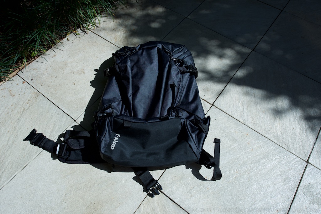
My bag is the Anthracite colour. It’s black. VERY Black. Like “sucking all the light out of the room so you can only see it by its silhouette” black. All these pics were shot in daylight, metered with incident light, and colour meters, then shadow recovery in Aperture had to be turned up to the maximum to show the details. When you look carefully, you can see a checkered pattern, and it’s got this slightly rubbery texture.

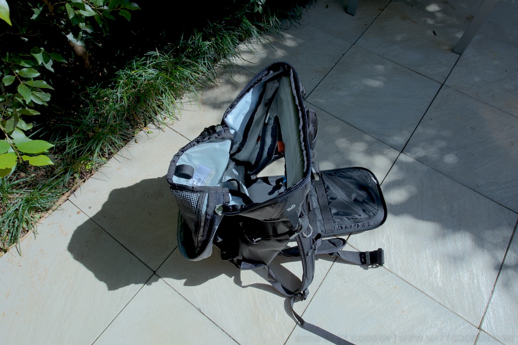
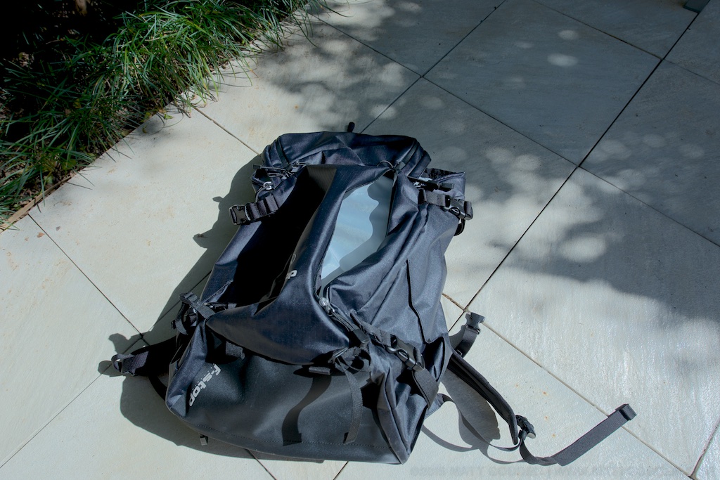
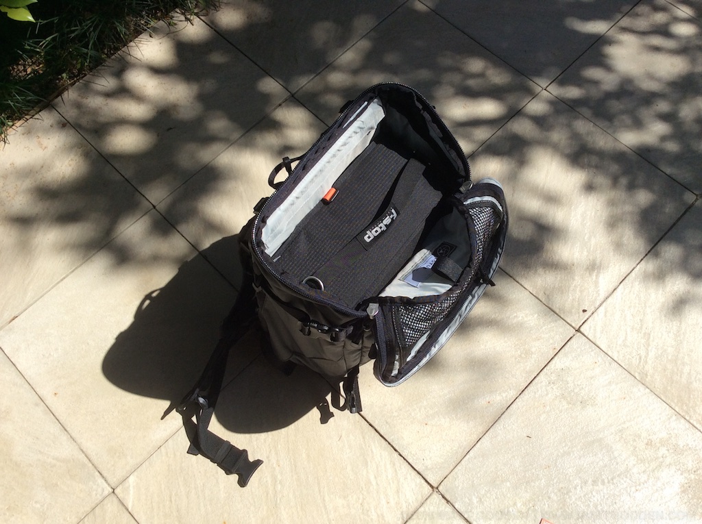
The inside of the side and front pockets are of a lighter material, and don’t have the same rubberised feel to them. Given that the front pocket has a weep-hole, and is intended to be a place to stow wet outer layers, or snow tools, a question that arises is…

Moisture Ingress?

The best test I could think of was to get a bottle of water out of the fridge, run it under the tap, to simulate condensation, and then rotate it against the inside lining of the front pocket, while holding up a tissue to the other side, to see if any water wicked through. While the cold came across, as far as I can tell, the tissue itself is bone dry.

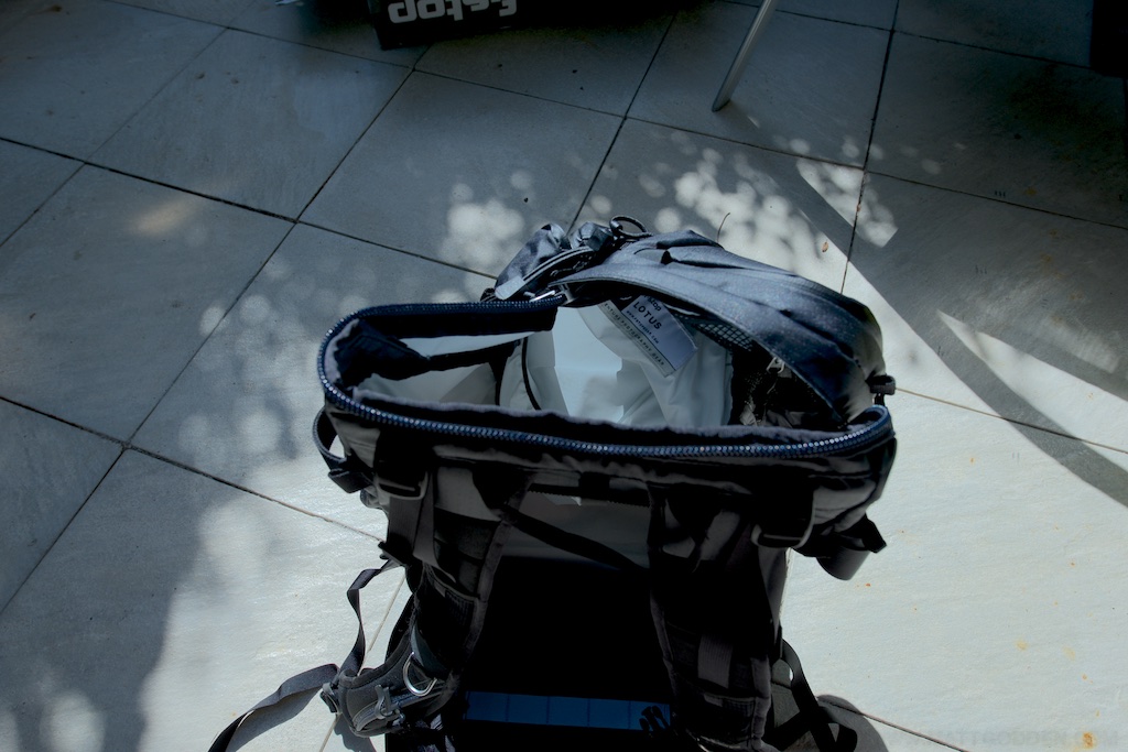
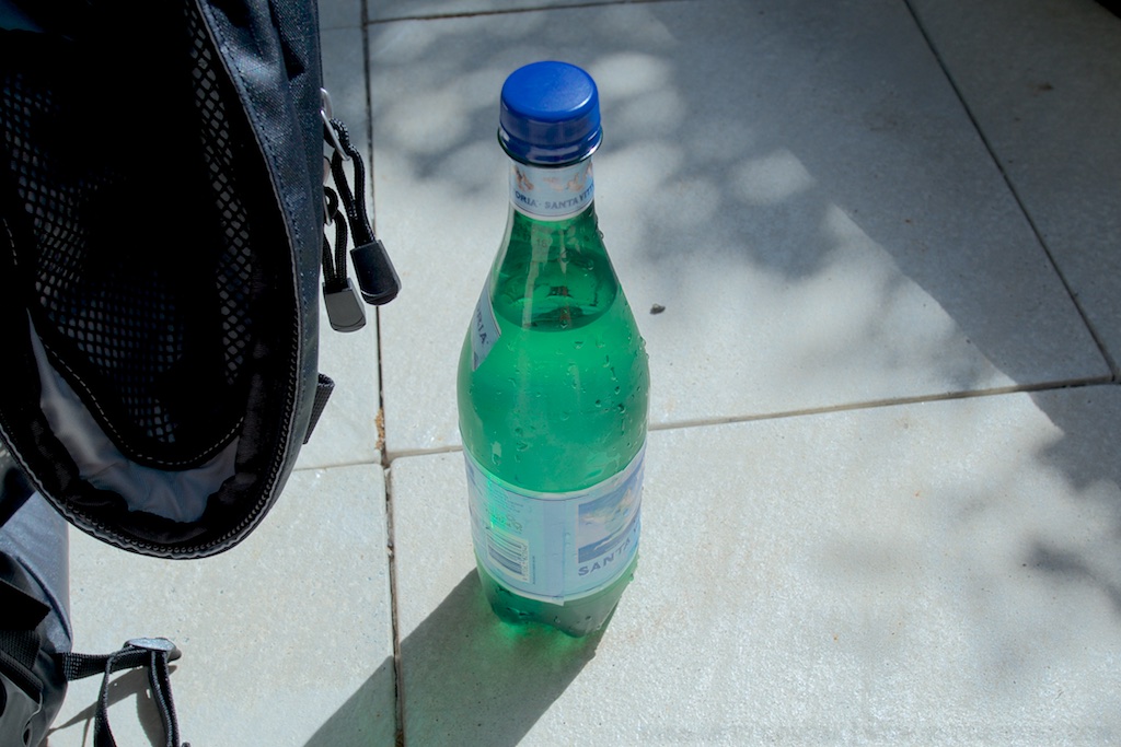
The inside of that front pocket is actually the pouch for an internal water bladder, so you might be wondering why I’m concerned – it’s mainly down to that pouch also being where an iPad or small laptop is supposed to sit, if you’re not carrying water internally. More on that later on.

ICU Fitting

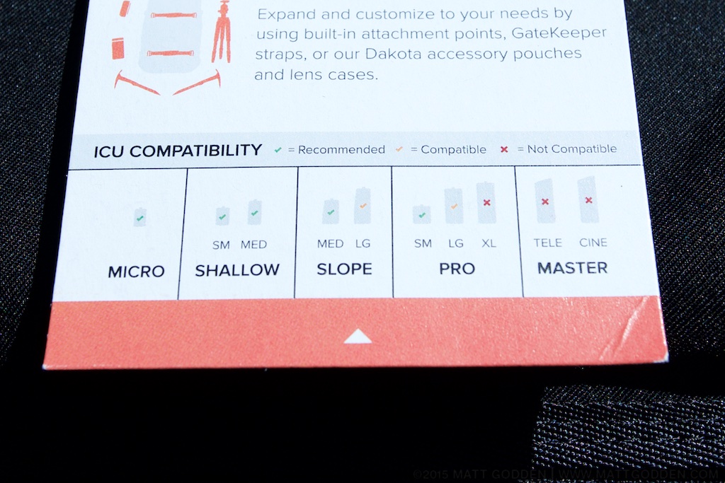
What’s an ICU? F-Stop’s bag system is based around the camera being in a padded, removable bag, the Internal Camera Unit, which straps into the shell, to be accessed via the back panel. These ICUs come in numerous sizes, and styles. One of F-Stop’s weaknesses, however, is their pre-sale documentation. When I bought this pack, for example, there was nothing on their website to tell me which ICUs were suited to the pack. As a result, I made a best guess, and bought one which is listed as “compatible” but not “recommended”. The bag itself has a tag showing what they recommend, but this startlingly useful information is not available online.

In the Large Slope ICU, I can fit my full current kit, which comprises: Nikon d800, Nikkor 14-24g, 60g Micro, Spherical pano head, Manfrotto magnesium 3-way head, light meter, colour meter, some filters, and a few other cables, battery charger etc.

The way this is supposed to work, is you fold the top of the ICU under it, slip it into the bag, then attach the velcro tabs around the eyelets on the bag’s frame to hold the ICU against the back aperture. What I found is that the ICU didn’t naturally rest far enough into the bag for the tabs and eyelets to line up. Pulling the foam from the ICU lid went part way to alleviating the problem, but it still felt like I was forcing it to fit in place.

Now, it may be that this serves a purpose, ensuring the ICU is tensioned against the bottom of the bag.

The other problem is that when attached, the ICU is actually taller than the inside of the bag, so with the back unzipped, the ICU wedges the back open. Again, maybe there’s a logic to this, but my next ICU is going to be a shallow model.

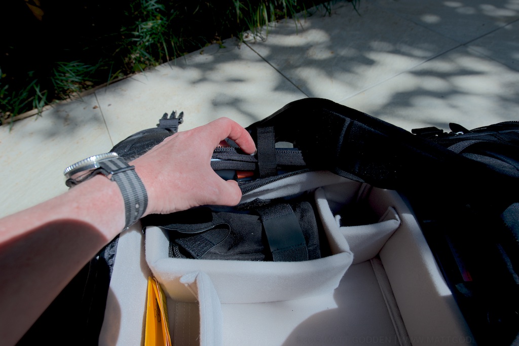
There’s also a mystery eyelet at the top, which should be perfect for securing the top of a tall ICU, but there’s no matching velcro tab on mine.

Hydration

Hydration was one of the features which really caused headaches for me while looking around for bags. My previous (non-camera) bag, by Camelbak, is more of less the gold standard for this. The bladder is kept in a sealed, insulated compartment, centred on your spine. Looking around at camera bags, hydration was either absent, or fixed on one side. I wanted the freedom to shift water-weight depending on whether I had a tripod strapped to the side of the bag or not.

The Lotus’ external pockets are large enough that you can put a 2 litre bladder in any of them. There’s an internal pocket to hang a bladder in, but it shares duty as the laptop sleeve. I also can’t quite trust the idea of keeping water inside the pack with my electronics.

If there’s a criticism I can level here, and an improvement for the next version of the pack, it’s that hanging loops in the side and front pockets would provide a huge utility and flexibility boost, with no appreciable downside.

Compatibility

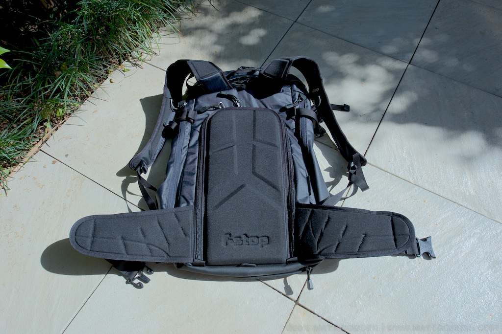
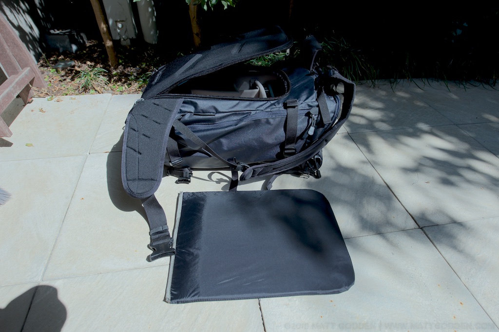
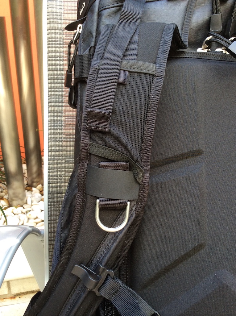
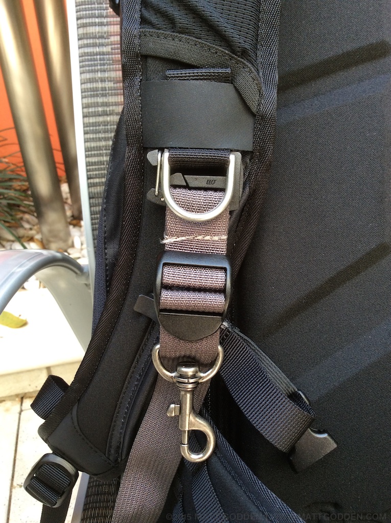
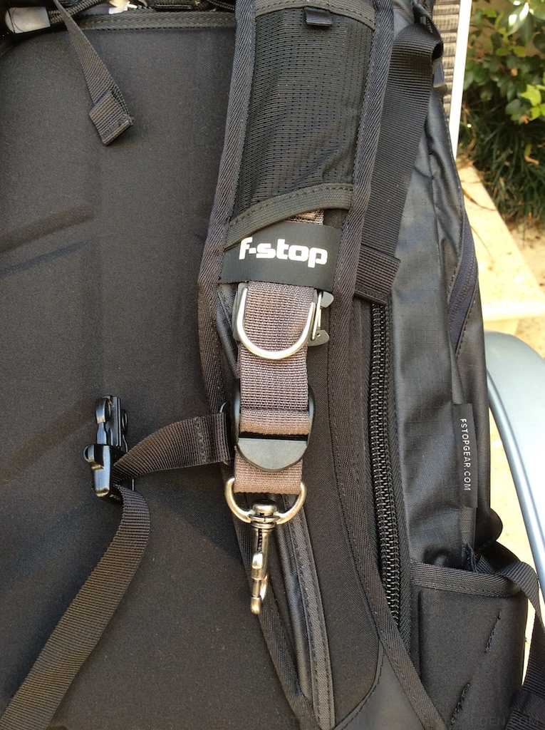
One of my favourite accessories, Thinktank’s Camera Support Straps, rely on the webbing rails on the shoulder straps of most packs. The Lotus lacks these, but thankfully, the webbing loop used for the built-in D rings is large enough that the clip for the strap can thread through it. As an added bonus, by rethreading the tag end back through, and up under the snack trampoline (there’s a springy pocket in the shoulder strap for snacks – I think that term is as good as any), it’s neater than on my previous pack.

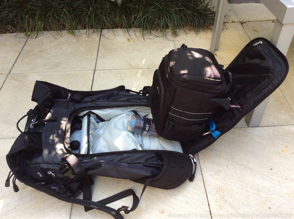
The other great compatibility feature is the molle webbing on the inside of the back panel. This gives you the flexibility to mount other bags inside the Lotus, as shown here, a Lowepro holster bag attached with carabenas (which I’m doing while I wait for a local dealer to get stock of the shallow ICUs). It’s not quite as elegant as an ICU, but it still means the camera can be accessed separately from the contents of the top of the bag.

Conclusion?

It’s been a couple of days of carrying this around all the time. The Lotus is a bigger bag than I’m used to, but small enough that I can adjust to that, for the freedom to have a well designed bag to constant carry a couple of kilos of camera and lens. Also worth mentioning, the pockets in the lid, one accessible from the outside, one from inside, are spacious and majorly convenient for getting access to a lot of stuff without disturbing the inside of the bag. Further on the topic of the lid, it’s attached to open away from you when the pack on on your back, which means the zips can sit near your neck, away from potential pick-pocketing.

So, overall, my initial impressions are that this is going to be a serious piece of kit. It’s got its quirks (like the 14-24), but my gut feeling is that it’s going to be a tremendously enabling piece of gear.

If this article was of use, a donation would help support my projects.

About our new Prime Minister…

Back in the late 1990s I worked in tech support for OzEmail, a company owned & managed to varying degrees by the man who is now Prime Minister of Australia.

Back in those days, Internet access was dialup, and sold based on time connected. Every time you connected to the internet, you also incurred a local phone call with Telstra, who were the dominant local telephony provider, as a part of the process.

So eventually, the economics arrived at a point where we could offer a product that provided for unlimited time dialup – an “always on” internet, provided you could dedicate a phone line to it. The name of this product (from memory) was OzMegaSaver.

Well, there was a problem with OzMegaSaver that soon became apparent – dropouts. People were having huge numbers of disconnections, even after we went through optimising their modem’s initialisation strings, and running up huge phone bills in the process. Thirty cents a call adds up when you’re having multiple disconnects every day. We were instructed, by higher levels of management, to tell customers that at the end of the day, the problem was that their modems were letting go of the connection because their phone line couldn’t sustain the high speed connection.

We certainly didn’t tell them what was common knowledge within the support department – that it was OUR Bay Networks dialup equipment that was disconnecting the customers, and that the problem was so endemic, that Bay Networks had sent staff out from America to try and make the gear they’d sold us work correctly.

You can imagine the outcry, if all those customers knew their massive phone bills were a result of their ISP dumping their connection.

It’s just one anecdote, and Turnbull’s involvement in the company may have been completely incidental to the problems, and subsequent coverup. However, let’s say that when people argued Turnbull’s “experience” in telecommunications counted positively towards his plans for the NBN, that just sounded like a tsunami of fail and farce.

Manga Panel Design Theory

Introduction.

“Poor artists copy, great artists steal”

This quote, in various forms, including the less judgemental “Immature artists copy, developed artists steal”, has been (mis)attributed to many artists throughout history. It expresses a fundamental truth within any artist’s practice – that all technique is learned through imitation, but that imitation is only the first part of the process.

The difference between copied and stolen techniques comes down, in my opinion, to understanding not only the how (copying), but more importantly the why of a technique. To steal in art, is to take an idea, and be able to pull it apart and rework it to suit your own needs, without breaking the things that made the idea valid in the first place.

What does this have to do with comics? Well, comics is an artform which is not only built upon copying – witness the plethora of “how to draw (style) comics” manuals, but is also practiced, frequently, by people who are not formally trained as artists. In my experience, academic training is where the why mindset is nurtured.

This brings us to the point – the often misunderstood theory of panel design, especially as it relates to Manga, and most especially as it relates to Manga-style comics produced by westerners.

In western comics, the order in which panels on a page are read is often expressed along the lines of “left to right, then down”, sometimes with the addition of a “look at what’s happening in the panels if there’s any confusion”.

In the world of western languages, this may seem self-evident, after all, western scripts are universally(?) written in a left-to-right horizontal direction. Given the popularity of Manga, and the number of westerners for whom the graphical style of Manga is the dominant influence, this requires a deeper consideration. Unlike western scripts, Japanese is written from right-to-left, and may be either horizontally or vertically aligned. When a western, english language “manga artist” tells you the rule is “top right to bottom left, and always horizontal before vertical”, it becomes apparent that there are some fundamental misunderstandings about the design theory behind Manga amongst western practitioners.

Left to right or right to left?

When published in Japanese, Manga employs a right-to-left reading order, and broadly a top right to bottom left page reading direction. This is obviously the opposite of the way a western book is laid out and typeset. Japanese books are read right-to-left, because the Japanese language is written right-to-left. Starting in the origin corner of the page, the text you read progresses in the same direction as the overall page. Likewise, western comics, and western languages are written and read in the same direction.

When Manga were first translated and released to western audiences in the 1980s, publishers like Eclipse Comics, and translators like Studio Proteus would mirror-image flip the pages, so they could be read left-to-right. This also required subtle re-writes of the script, to ensure that spatial references (characters noting on which side an eye-patch restricts vision, for example) are updated. In the 2000s a counter-trend emerged, of translating text, but not flipping pages. This often extended to not translating or retouching the sound effect text, and was claimed to be in aid of producing a more “authentic” translation of the original. A cynic, or perhaps a realist, might suggest that it’s a bit convenient for “authentic” to coincide with “less work” and “cheaper”, especially when it produces a product that reduces the ease with which the reader can access the work.

Mirror-flipped or not, however, remains a controversy for translated Manga. When it comes to Manga-esque comics written in english, or any other left-to-right script, there should be no controversy – your comic should be read in the same direction as your language. Yet, as I mentioned earlier, there seems to be a (sub)culture of creating right-to-left Manga-styled books amongst western comics artists.

This is a perfect example of the copying vs stealing dichotomy: The immature artist copies the right-to-left reading order because that’s what Japanese language Manga does, the developed artist steals the design methodology, and understands that the reading direction is a function of that language in which it’s written, and is a means to the end of communicating the story, not an end in of itself.

“Authentic” Manga.

I’ve seen a defence of using right-to-left direction for english language Manga-like comics expressed along the lines of claims to authenticity – that Japanese Manga is right-to-left, so doing western Manga-style comics right-to-left is more “authentic”, and presumably, more correct.

This is where we get into the fraught world of cultural appropriation (and potentially identity politics) – where is the line drawn between adopting elements of the style of another culture’s art, and attempting to pass oneself off as an “authentic” practitioner of another culture’s art? Manga itself is a result of the traditions of Japanese drawing encountering Disney’s cartoons during the postwar occupation of Japan by American troops. The big eyes, the animation style – that’s yet another example of stealing in the artistic sense. Something from one culture was so thoroughly adopted and coopted by another, that it is now synonymous with the thief.

What’s happening with Manga produced by westerners is often not that, however. If you’re a westerner, you’re not an “authentic” Manga artist. What you produce will never be “authentic” Manga. A white Australian could learn everything there is to know about Aboriginal art techniques, learn the cultural stories, live with local Aboriginal groups – they will never be able to sustain a challenge to the authenticity of calling themselves “Aboriginal Artists”. In the Aboriginal case there’s also post-colonial and socio-economic outrages involved – so not to suggest that these two analogies are of equal severity, merely that they are structurally equivalent.

We have a long and sordid history of white artists passing themselves off with fake Aboriginal names in Australia, and this is the thing with authenticity – it derives from the artist, not the art.

Get to the point!

What is the actual theory behind panel layout in Manga? Here it is, in it’s simplest form:

Scanning from Origin to Destination (top left to bottom right for western script, horizontally flipped for Japanese), find the first edge-to-edge gutter, and divide the page. Repeat recursively.

(Note: yes I appreciate the irony of a grid layout here, given my thesis is about the problems of grid layouts – read across then down.)

The Manga layout formula is inherent to the design. It’s a hierarchical rule, built on a consistent internal logic, independent of, and adaptable to any language. What this means, and what is a defining characteristic of Manga panel design, is that grid layouts, where edge-to-edge gutters intersect, are rare / forbidden.

Grid layouts are claimed to “work” (and I would argue they don’t actually work) in western comics because western script is always horizontal – it’s always across before down. That’s a problem as far as I’m concerned – the “rule” isn’t inherent to the design, it’s imposed from an external set of knowledge. Without the content of the panels, and without knowing that the language was written horizontally, there is nothing in the way western comics are designed which reveals the correct panel order.

It is only the fact that people in western society are raised in a horizontal text culture, that makes the idea of “horizontal before vertical” seem like a natural, intuitive rule. Worse still, most people who would argue for grid layouts have probably been reading comics for so long, that they are unaware of having internalised that arbitrary rule.

“I want equal sized panels to communicate the experience of equally spaced, equal-length moments in time.”

Ok, try this:

But what about an artist’s personal vision? What if an artist really likes the symmetry of the grid? Why should an artist follow these rules?

At the end of the day, a comic page is about communicating the events depicted in the panels. That is the ultimate goal. A panel layout is the user interface for that goal, and when the artist’s personal desire for aesthetic expression conflicts with clear, unambiguous readability, it is their responsibility to get over themselves, and put the reader first.

Be careful what you wish for…

There’s an idea spreading around the Mac-using world at the moment that Apple should abandon iTunes, and start again from scratch with separate apps handling its various abilities.

There’s one problem with this which gives me pause.

Every change Apple has made to iTunes since version 10, has made the product worse. What has made it worse, is not the overloading of features, but the mindset behind the design of the new features.

UI elements no longer have tooltips. Podcasts have been screwed up, reoriented around streaming and breaking functionality for the download-and-keep model. Lets not forget the disastrous iTunes 11.2 “upgrade” which introduced a new “saved” podcasts feature, which allowed you to protect individual episodes from auto-deletion – and which the upgrade process told you would be applied to ALL of your previously downloaded podcast episodes. That function was faulty, and since iTunes had auto delete after listening defaulted to on, upto half the episodes in many of my stored podcasts disappeared in an instant. Not in the trash, no undo, just gone.

Can’t you just re-download them?

That presumes two things, firstly that bandwidth is free and uncapped, and secondly, that all podcasts keep every episode in their feed forever. Many don’t. Some of my subscriptions have gone offline entirely. The point is, user data is sacrosanct, and deleting it without an explicit command from a user, with an “are you sure” dialog is the greatest sin a piece of software can commit.

This is a symptom of a part of the larger problem Apple has, those who are in charge of the direction of its products are possessed of such immense bandwidth privilege, they seem incapable of designing products for an offline reality. The sheer insanity of using a server on one side of the world, to move a document between two devices a foot apart, or that two devices which can be physically cabled together, can’t share calendar reminders without an internet connection, is hard for me to wrap my head around.

So, given that all the things which are bad about iTunes, are post-version-10 changes to the product, what makes anyone think that an all-new music solution would be anything other than a reflection (and likely a magnification) of the philosophy which created all these ruinous changes?

What’s wrong with iTunes, are the new parts of iTunes, not the presence of what is increasingly becoming “legacy” functionality.

Fish (Noir) Experiments.

These are from two years ago, but since I’m heading to the same location, having planned around the position of the sun and the stage of the tide to try to reshoot with a polarising lens to cut glare, I thought it was worth putting them up for a comparison.

How I’d Rewrite the Star Wars Prequels

So I’ve been listening to The Incomparable Podcast’s post-mortems of the Star Wars prequels, which I would recommend everyone have a listen to. They cover how wooden the acting is, how creepy, leery creepy Anakin Skywalker is, and how in the end, the character portrayed – a whiny little idiot (no really, a genuinely ignorant brick-stupid person, who gets played for a fool) isn’t recognisable as the Darth Vader that we see in the actual real star wars films – a dignified, menacing, capable and above all, self-assured, enforcer and fixer.

So, in light of listening to all of this, and the Redletter Media critiques, I thought I’d have a bit of a go at how I would have structured the star wars prequels – cause if there’s one set of films that’s in a dire need of a reboot, it’s Episode 1, 2 & 3. This isn’t going to be a full narrative or fanfic, more a loose collection of elements could be done differently to make for more compelling plots, and more believable characters. Largely it’s just an exercise on my own part to work in a world I didn’t create.

Disclaimer: I’m not going to claim that any of these ideas are unique or original – I’ve only seen the films (and owned the toys / McDonalds meal cups etc when the holy trilogy first came out), not any of the extended universe, but they’re thoughts I’ve had without knowingly taking from other sources.

The Force and its relationship to the Jedi & Sith

Midichlorians are gone – a mechanism isn’t necessary.

The Force works differently depending on whether one pursues the light or the dark side.

  • Light: The user becomes more and more powerful as they age, culminating in the ability to become a force ghost when they die, if they live long enough. Actively using the force to effect the world slows down one’s development – it works like compound interest in a savings account, and it costs every time it’s used.
  • Dark: as above, with age comes power. The Dark Side can prolong corporeal existence, but when one dies, that’s it. Using the force to effect the world speeds up one’s development – it works like an exercised muscle.
  • They cancel each other out – so pursuing one path reduces the time available to pursue the other to its critical mass of immortality.

This sets up the Jedi as conservative, passive – avoiding conflict and devoting themselves to meditation because they have an eternal payoff at the end, which they risk if they die too young, or are too profligate with their Force use. Their “negotiation” skills are more about jedi mind tricking the various parties, than combat. Their martial skills are of prime importance when combat is required, because they need to avoid using the force in an active manner.

The Sith get a vampyric element to them – they can speed up their development by harvesting other force-users, both Sith and Jedi. Their almost mythical status is because it’s rare for a Jedi to meet one and survive – they fight and use the force so aggressively. If a Jedi is “eaten” by a Sith, they don’t get to be a force ghost – they’re gone completely.

Like elephants, their strategy is to get so powerful that they have no natural predators left, and can live out a perpetual corporeal existence.

Biology and the Force

He’s more machine than man now, twisted and evil.

The force depends on bodily integrity – losing a limb will permanently retard development and reduce one’s end-potential. This is why Darth Vader doesn’t get to the level of having force lightning, and is instead more reliant on the lightsaber than a Sith would normally be. His shot at immortality is that there’s less of his human body left to preserve, the technology can keep him going in lieu of the reduced preservation abilities of the Dark side. General Grievous is a great example of a Sith that has been so thoroughly damaged that now he’s only a collection of organs, and there simply isn’t enough meat left of him to channel the force at all.

Above all, the Jedi, and to a lesser extent the Sith, are body-proud.  Anakin’s loss of a hand is part of what sets him on a path to the Dark Side – knowing that he’ll never be as good as he should be because of his “imperfection” gnaws away at him, beginning the slow poisoning his mind.

 The Political Opening

The Jedi Council could actually be ghosts as far as the eye can see, like the city under the mountain scene in the final Lord of The Rings film. Their inertia against taking personal risk is symptomatic (and possibly causative) of the general malaise within the galactic society at the time – democracy is failing, the government is ruled by a corrupt bureaucracy, and corporate thuggery is effectively oppressing the galaxy. The Jedi experience none of this, and what they see of it, it’s not their place to get involved unless the bureaucracy requests it, which only happens when it’s actually helping the corrupt.

By positioning the Jedi as actually being bad guys from an objective standpoint, Anakin has a legitimate reason to hunt them down and destroy their power structure. Darth Vader has no reasonable motivation unless he’s righteous in what he does – he has to believe the Empire is achieving something.

Anakin’s Fall

The Jedi’s refusal to act when the clone wars erupt (could be nothing to do with the creation of stormtroopers) culminates in entire planets being devastated (which neatly mirrors the Empire later creating a device for that specific purpose) – genocide occurring over and over. Anakin is expelled from the order for trying to rally the people of a planet which is to be cleansed. The great crime of “getting involved”.

The Creation of Darth Vader

Anakin turns himself into Vader, the cyborg. His climatic transformation occurs as he’s fighting his way through the Jedi temple. He fights more and more ferociously, as we see Luke do at the  end of Return Of The Jedi, but using the force, and being injured in the process. In one of the minor boss battles during the process, he loses an arm, and rips off the arm of a robot support soldier, and using the force, fuses it into his body – much like Tetsuo using telekinesis to make an artificial arm in Akira. This process continues, a leg is blown off by a laser, and he rips a robot’s leg off, making it into a functional limb through sheer force of will, depleting his light side reserves, and so he takes the final step, and consumes the next Jedi he encounters, becoming a Sith. He eventually works his way through the temple, killing, consuming and being shot and chopped up, until by then end, he’s a patchwork of different bits of robots, and all the Jedi are dead and consumed.

And he never says “noooooooo” – the best bit from The Incomparable was one of the panellists suggesting that Vader’s first word post-transformation should be “good”.

Once Vader is created, and the Empire established, he is a peacemaker. Sure the “stop fighting or I’ll come back here and kill all of you” form of diplomacy is a bit arbitrary, but he’s seen what galactic conflict and genocide, and “not getting involved” can do. He believes in what he’s doing. He is, in his worldview, the good guy.

Related to that, do we ever actually see The Empire do anything “evil” outside of the scale of what it is? Is the destruction of an entire planet with a terrorist leadership that much worse an act (in terms of scale) for a galactic government, than the American government nuking a couple of Japanese cities? You don’t see storm troopers beating civilians in the streets, you don’t see The Empire using slaves – they genuinely come across as an effective professional military trying to do a difficult job, keeping peace on a galactic scale. Calrissian complains about taxes levied on Bespin, as if being required to follow regulations in the extraction of natural resources, and paying taxes on your earnings is the very face of despotic evil.

Nope, I’ve decided The Empire were actually the good guys.

Why publish on iBooks?

Edit: Please note, while this article is still valid, as of 2021 I have moved my efforts towards publishing on an independent web store.


Something that’s been of interest to me lately, is why so few of the local comics people I know publish on Apple’s iBooks store. It seems obvious to me why you would, but I can also see the reasons why you wouldn’t – it’s a single platform (Mac and iOS) reading solution, and requires that you have an American taxation registration. There’s also only one graphical tool for producing books for it, InDesign Creative Cloud, which is a $20-$30 monthly subscription cost (or $240/year). Note, Apple offers the iBooks Author application, but it doesn’t do paginated reading, or allow images to be zoomed larger than full screen.

But, if you were to look at iBooks, here’s a list of the reasons to compare against whatever solution you’re using currently:

  • Revenue Cut: The basic revenue split is 70% you, 30% to Apple. Any other comics reading / buying app that offers in-app purchasing means the app vendor is paying you out of their 70% cut of the cover price.
  • First Party Application: iBooks is already on the device, and customers can buy books within the application.
  • Price Control: Apple can never override your price to discount your book and lower the market’s expectation of the value of your work.
  • Product Control: You do all the authoring, Apple doesn’t change your files, resize your images etc. What you create and test, is what the reader gets.
  • Preview Control: You can author the preview separately to choose what it contains, and Apple adds a page with a “buy full version” button to the end.
  • Free Books Cost You Nothing: Offer your books for free, you don’t pay any fees at all. If you’re only offering free books, you don’t even need to fill in the financials and tax information.
  • Quick Approval: Apple claim that 90% of books get reviewed within 1 day. In practice I’ve found it takes about 7-10 days from submission to being on sale.
  • Copy Protection: If you want to use DRM, Apple’s solution is unobtrusive and effective. If you choose to go DRM-Free, your file is still watermarked to the buyer, so you can get an idea of where that torrented version originated.
  • Analytics: live sales and revenue data broken down by territory and exportable to spreadsheets.
  • Good Tech Support: I’ve only had positive experiences with Apple’s book developer support staff. They have an Australian freecall phone number, and the staff take ownership of issues.
  • No Multiyear Contract: You can pull your book from the store or suspend sales at any time. People who’ve already bought it will still be able to download it, but it won’t be available to anyone else.
  • No Exclusivity Requirements: you can put your book in any other store (the iBooks Author application, which isn’t really good for comics, only produces files for the iBooks store).

The New Apple Paradigm

It’s time for a bit of recreational Kremlinology regarding Apple’s strategies.

When Intel and Apple brought the Thunderbolt interface into the world, there were a lot of interesting possibilities created. Thunderbolt being essentially the PCI bus on a wire, many peripheral solutions that were previously done with internal cards, could now be created as breakout boxes, which could serve both desktop and laptop users.

Since Thunderbolt is capable of carrying all of the other peripheral busses, one great solution it enabled was Apple’s Thunderbolt display, which could act as a peripheral hub for a laptop. You plug power into the display, and then the display has an upstream cable which branches into thunderbolt, and Magsafe power for the laptop. So with that one cable, your laptop effectively becomes a desktop (and your laptop’s power adapter stays in your travel bag).

My 68 year old mother, who is an accountant, uses this solution. She has a light, compact, 13″ Macbook Air, with which she travels interstate every quarter to work with clients. In her home office she has the big display, keyboard, mouse etc. On the road, the system is light & compact, at home it has screen space for her MYOB Windows VMs, remote desktop sessions with client computers etc.

The new Macbook isn’t set up to do his. It’s only external display options are HDMI and VGA, and with no Thunderbolt due to its sole USB3-C port, arguably, it never will.

It remains to be seen whether this is a repeat of the goof that was the original 13″ Aluminium Macbook (which dropped the firewire of its polycarbonate incarnation, only to regain it in the next revision), or whether this is a new paradigm of less versatile Macs, which have a narrower but deeper usability. By forgoing all the ports that make a laptop able to be both a portable, and desktop, Apple have made a computer that is arguably better when it’s being a portable.

The question is whether this will make its way into the rest of the laptop lineup. If so, I think we can probably say that the paradigm that Apple is heading towards, is this: People who need both desktop and laptop usage scenarios, should be buying a desktop and a laptop, and then using Continuity to move their work state between devices. The net result of more device sales for Apple is obviously just a happy coincidence.

Rotating a .NEF Raw File

One of the problems I’ve had using Apple’s (now end-of-lifed) Aperture photography software, is that it doesn’t make changes to an original RAW file. Everything changed within it is done using versions – essentially metadata – so that you can have a dozen different variants of a file, but only ever have one taking up space on disk.

It’s a great idea, except when your original has a problem, like for example the camera has recorded orientation information that you don’t want applied. Aperture provides no way to alter the RAW file. You can create a rotated version in Aperture, but exporting the RAW will output the original un-rotated edition.

The solution is to use Nikon’s own ViewNX software. It’s ugly as sin, not at all Mac-like, but when you rotate a RAW file in it, the file on disk is rotated, while staying as a RAW.

Then, you have to reimport the image as a new file, and delete the old version. Simply replacing the old one with the rotated version in Aperture’s library won’t show up as having been changed when you re-launch Aperture.