Matt Godden

human : artist

Bring content into view.

Main : Timeline

Pinned and chronological feed of posts. Check The State of The Art for the big picture.

Review: Adonit Jot Script

Opening disclaimer: I was provided with a “keeper” review unit by Adonit, and Mobile Zap Australia. Since this is a review of a handwriting-oriented device, try reading it in the original, handwritten form of the images below, but please note the edit in the typed version.

The Jot Script is the first of the new “pixelpoint” styluses from Adonit – the maker of my current favourite stylus – the Jot Touch 4.0.

It’s important to bear in mind that this device is primarily designed to be used with Evernote’s “Penultimate” software, and unlike the Jot Touch, it’s primarily a writing stylus. As you can see so far, it’s pretty accurate at capturing my godawful handwriting, which would put the average doctor’s scrawl to shame. The point being that despite how unreadable it may be to others, it’s perfectly readable to me.

Zoom View

Here is where we get to Penultimate’s real strength “zoom mode”. In this mode the screen zooms in and scrolls under the pen in direct relation to how fast you lay down new letters. The faster you write, the faster the page scrolls under the pen. This means you can slowly progress your pen across the page, and just hold your pen up off the surface for a second or two and let the program just drift a space in under the pen.

As you can see from this page as compared to the previous page, the text is far cleaner and more readable. What’s most interesting about this interactive design is that you can see the non-zoomed view in the background, greyed out so as to not distractfrom what you’re writing, but it keeps you aware of how far down the page you’ve progressed as you write.

All in all, it’s a pretty brilliant solution to the handwriting dilemma on the iPad, while avoiding the Newton’s trap of handwriting recognition.
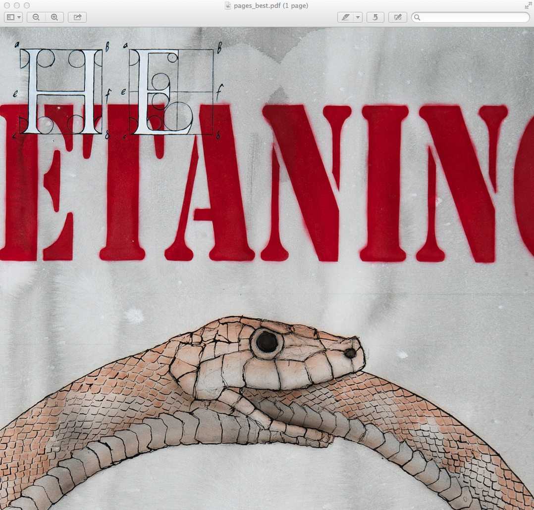
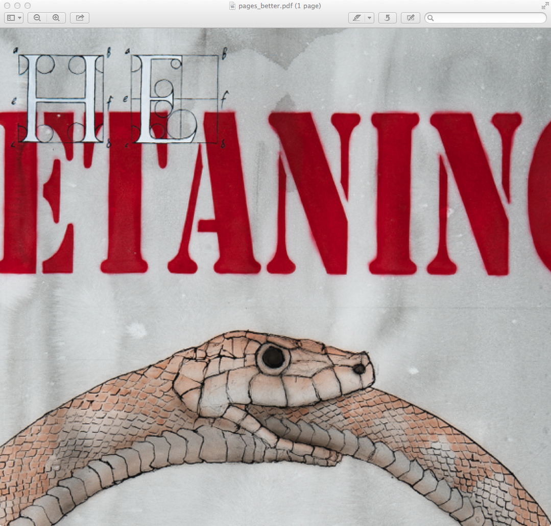
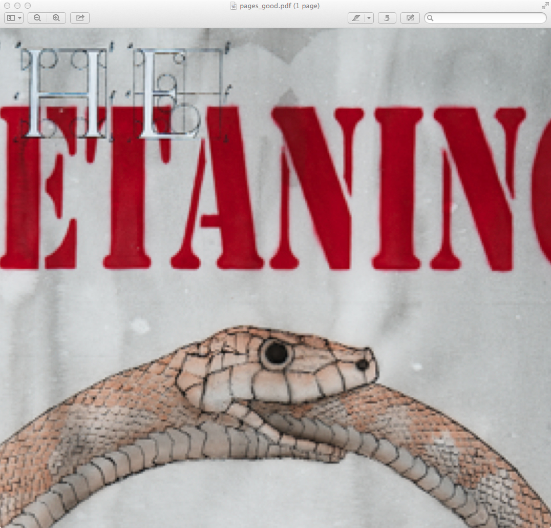
The Pen Itself

While not feeling quite as sturdy as the Jot touch 4.0, it’s still sturdier than any of the pens offered by Wacom for their Intuous / Cintique (sic) tablets. The machined Aluminium barrel meets a plastic centre section where the on / off switch then transitions to a plastic grip area,

Important Edit: I just ran the grip area over my teeth (yes weird I know), and realised it’s actually the same metal as the barrel – the texturing in the surface had confused me as to what the material was – it feels quite different to the smooth metal of the barrel. This more or less negates any criticism of the product’s sturdiness compared to the Jot Touch.

and down to a metal tip. It feels lighter, and plasticer than than the Jot Touch, which is unsurprising, given its lower cost. Possibly my only major criticism is the choice to go with a AAA replaceable battery, rather than the internal rechargeable of the Jot Touch. But then again, these are the sacrifices that are inevitably made to bring a product in within a certain budget. My hope would be that the new Jot Touch with Pixelpoint can fulfil all the tasks the script currently fills, enabling users to carry just a single pen.

It should be noted that I’m left-handed, and that may haveand effect on the performance of the product. But as you can see from the past few lines the pen is quite capable of running writing, for those who refuse to print.

Conclusion

What the Jot Script provides is a fantastic environment for handwritten note taking that can be faster than a keyboard for quick – err, jotting of ideas. It has a major strength that text and drawing can be integrated thusly: (note look at the final gallery image)

One thing to watch out for is that drawing smooth curves can result in stepping as you can see here. But again this seems to not have any effect on handwriting.

As you can see in the top left corner, this is largely a result of the speed at which the lines are drawn. Fast avoids the stepping.

This is a device which does what it claims to do, and shows off the potential of the new generation of fine-point styluses Adonit is moving towards.

If this article was of use, a donation would help support my projects.


iBooks EPUB Cover problems

How do you ensure the iBooks library image is readable, when the typography of your cover is too small in icon view?

The answer to that is actually really simple, but has a quirk that can trip up a publisher, because the behaviour of files downloaded from the iBooks / iTunes store differs from how they work when loaded directly through iTunes or iBooks (formerly Book Proofer).

Solution first, then quirk afterwards.

By default, iBooks uses the file listed as the cover image in your package.opf file to generate the icon:

<item id="cover" href="images/cover.jpg" media-type="image/jpeg" properties="cover-image"/>

That image is the one you create optimised to be seen as a tiny icon in your iBooks library, which in icon view has no text labels (the origin of this problem).

The image optimised for full screen viewing and placed within your cover html page can then be listed separately:

<item id="front-cover" href="images/outside_front.jpg" media-type="image/jpeg"></item>

When you load this EPUB into iBooks, the image tagged as having the “cover-image” property will be used to create the icon.

When submitting your files via iTunes Producer, you have a cover image imagewell, and Apple then uses that to create the image of your book in the iTunes & iBooks stores, as well as the iTunes Preview website. It also uses that image to create the icon you see in the icon view of your iBooks library.

So, if you try to use your “big art” version of the cover to be the hero image of your book within iTunes / iBooks / iTunes Preview, when someone downloads your book, that’s the version of the cover image that’ll be used for the icon view in the Library. Importantly, that image will override the image you’ve hard-coded into your EPUB to be the cover image.

So, the solution in the end, is to design your icon view art so that it looks OK when presented as the hero image of your book in iTunes / iBooks / iTunes Preview, and remember that the “Preview” tag will obscure the top right corner when a preview is downloaded – hence my putting the author name on the left in the examples above.

If this article was of use, a donation would help support my projects.


Surfing The Deathline – Third Dose

In the near future, homeless, unemployed software codemonkey Eddie has taken a job disrupting a machine intelligence, as a last ditch option to avoid having his organs brutally repossessed over his student debts.

To get the edge he needed, Eddie turned to a powerful neuro-enhancing hallucinogenic – The Deathline, so named for its tendency to kill users. It gave him the edge he needed, but in his triumph, he forgot to heed the warnings about visiting one’s own memory.

Now, he finds himself paralysed in what looks like a hospital room. He can do nothing, as the machine intelligence who ruined his life to this point, offers a terrible deal. Life in a prison of stone, or of his own flesh – a cure in return for his cooperation.

That is, until someone, and a great many somethings, open the door.

Meanwhile, Eddie’s ex-partner is testing her suspicions that her fiancé, their former employer, has been less than truthful about the circumstances surrounding Eddie’s firing. She isn’t liking what she finds.

This book is published in DRM-Free Fixed-Layout EPUB format.

Preview / Buy


Surfing The Deathline – Second Dose

In the near future, homeless, unemployed software codemonkey Eddie has found himself up to his eyeballs in student debt, in a city whose promise has become a prison now that his bank account has run dry

His only chance to repay the people who’ll take organs in lieu of payment, is to obtain a neural-enhancing drug known as “The Deathline”. With it, he will have the edge necessary to subvert a machine intelligence for an anonymous, paying client.

In this issue, Eddie meets with The Dealer, who will reveal the awful truth about the origins of The ‘Line. He also provides some important safety advice, which Eddie promptly ignores.

Finally, Eddie is ready to commence his run, but as he begins, he discovers to his horror that the series of disasters which lead to his current predicament may not have been as random as he believed, and that perhaps, you can never go home again.

This book is published in DRM-Free Fixed-Layout EPUB format.

Preview / Buy


Surfing The Deathline – First Dose

Sometime in the near future, software codemonkey Eddie is down to his last few dollars. Unemployed and living on, or rather under, the streets, he’s also facing “repossession” of his organs to cover student debts.

Now he’s been offered a job, a job that requires he risk his sanity taking an hallucinogen that’ll give him a chance at subverting a Machine Intelligence for a few critical minutes.

It’s called The Deathline, and he has to meet The Dealer to acquire it.

This book is published in DRM-Free Fixed-Layout EPUB format.

Preview / Buy


Derby Daze Volume 1

Derby Daze Volume 1 collects the pick of the non-square format images from my 2013 roller derby shoots.

The goal for these photos was to treat the images in a painterly fashion, thinking in terms of abstract patterns of colour, without trying to prioritise the representational nature of the picture.

This DRM-Free Fixed Layout EPUB version is available from the Golgotha Graphics Store.

Preview / Buy


Week 52 of 52

And that’s the final week done. A year of work, and a year of weekly blog posts.

In the last week I was mostly occupied with getting the new Derby Daze photography eBook done, and submitted to the iBooks Store. Development was substantially faster than the previous one – all the work I put in developing templates is now paying off. I’ve also been working on the eBook versions of Surfing The Deathline. With the templates done, they’re coming together super quickly.

Sometime during the next week, I’ll put up a final year wrapup post.

Oh, and someone in Europe bought The Metaning this week, which was nice.


And that’s the end of Aperture

Well, after all my problems with Aperture’s book printing, Apple has now announced that Aperture is being end-of-lifed. This brings with it conflicting emotions.

Aperture was developed in a time when the general Mac OS was somewhat more primitive than it is now. The capabilities demonstrated in the WWDC 2014 videos show that quite a lot of Aperture’s abilities have been migrated into the OS as a whole, and Aperture is to be replaced with a (lighter weight) iCloud-focussed Photos app. One of the themes of WWDC has been that applications are now highly plugin-able. One of Aperture’s great weaknesses was that third party filters and effects weren’t non-destructive. So if you wanted to apply a border to a photo, it had to be flattened into a TIFF file (an extra 100+mb for a whole image vs an insignificant addition of metadata to the original RAW file), and the border applied to it – negating the purpose of shooting in RAW.

The non-destructive plugin-oriented paradigm Apple unveiled at WWDC leaves me hopeful that even if Photos is a stripped down product from Apple, whatever is lost will be able to be replaced by third party plugins, which won’t require this stupid flatten-to-tiff workflow we have currently.

My biggest fear, is that the manual management facility – the ability to arbitrarily arrange projects with folders, subfolders etc will be lost. It’s a feature Aperture has, but which iPhoto does not, even when they share the same library. Tethering and fine-grained output options could potentially be replaced by third party plugins, but the representation of the library itself – the core functionality of the app is different between Apple’s two current photography apps, I would be surprised if that could be altered.

Right now, Aperture is a little under $90. If Photos is free, and the abilities of Aperture today can be aded as plugins for less than that, it could end up being a net win. If not, there’s app packages from Corel, DXO, and even Adobe if you’re a masochist.


Week 51 of 52

A lot of printing results came back this week, some of it great, some of it disastrous.

The Derby Daze [squareformat] book came in looking great, the printing looks nice, everything cool. Sadly not so much for The Metaning.

This brings up a bit of a problem – it seems like it’s not actually possible to get the work I’m doing printed through Apple’s Aperture printing

Looking at the options, it seems Blurb might be able to do the job for The Metaning, though it’s always irksome to have to pay a 25% premium to get rid of the Blurb logo.


More on Aperture Printing

After yesterday’s post on problems with a photobook produced and printed through Apple’s Aperture software, I thought I’d conduct a more thorough test. The conditions were setting up the same image as I’d used in Aperture, in Adobe InDesign, and Apple’s pages. The image was set up at the same physical size on the page, and then the page was output using various quality settings.

As can be seen, the basic problem is that Aperture is doing something in the PDF which puts white fringing on the black lines, which destroys them optically. In places in the book, the white fringing is more prominent than the black lines.

Recipes:

  • Aperture
    • The Print Proof when ordering a book.
  • InDesign CS5 Export to PDF
    • High Quality Print
    • Blurb print on demand books plugin quality
    • Smallest File Size
  • Pages Export to PDF
    • Good
    • Better
    • Best

Each pdf was then opened in Preview, the same area was zoomed to the same size on screen, and a screenshot of the window taken. Images were then opened in Photoshop CS5 and Saved for Web at 100% size with jpeg compression set to 100 / Maximum.