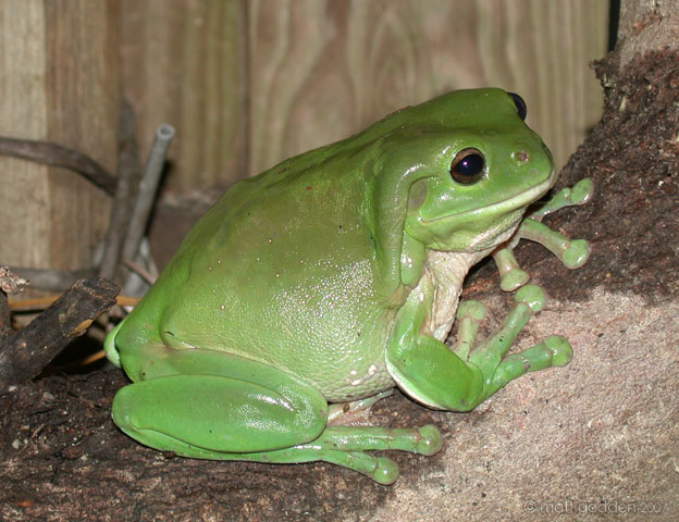
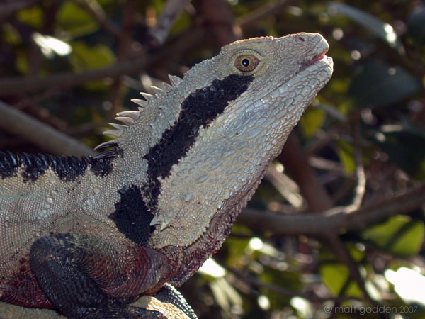
This guy was sitting right outside my mother’s place in Noosa, Queensland one night. He’s so wonderfully fat, and those perfect martian invader fingerpads – daww.
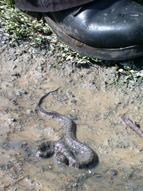
It’s kinda like wild kingdom there sometimes. One time, I was sitting in the loungeroom working on my computer, and I noticed movement out of the corner of my eye. Going over to investigate there was a baby Blue-Tongue lizard all of 3″ long, which seemed to have walked almost all the way through the house. As soon as he saw me, he raced with his stubby little legs as fast as he could. That would have been a great plan, except for the polished tile floor. He basically sat there, paddling furiously and going nowhere. So I put him outside, after recovering from fits of laughter.
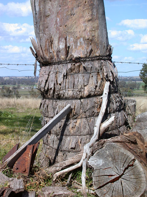 You’ve got to, well not love, but something, the thought process that lead someone to think “Yes, that living, growing tree will be a perfect fencepost. Let me wrap barbed wire around it”.