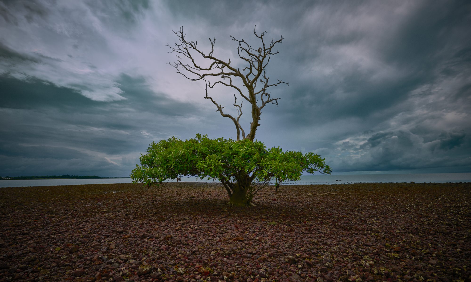
 One of Newtown’s most loved locations is St Stephens church and cemetery.
Apparently the final resting place to a number of (in)famous individuals, it’s overgrown nature makes it a picnic and photography favourite.
human : artist
One of Newtown’s most loved locations is St Stephens church and cemetery.
Apparently the final resting place to a number of (in)famous individuals, it’s overgrown nature makes it a picnic and photography favourite.
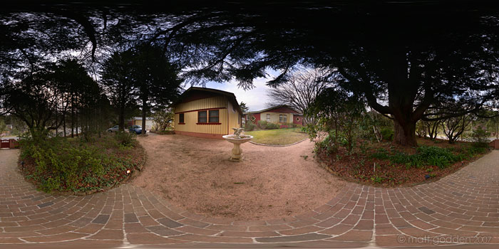 Cloudlands house is a place you can rent in the blue mountains west of Sydney. It may look like a simple weatherboard cottage, but once you’re inside it’s all dark wood panelling, fireplaces and big clawfoot baths.
 They have you right where they want you, in the worst place you could possibly be – paralysed in your own body. And now, there’s someone at the door.
She suspects he’s been deceiving her. He fails to redeem himself with the opportunity she provides. Now she’s going to have to get some answers, and show him the price of his lies.
40 pages long. Available free to read online (donations accepted – contact me if you want a print version, as I have some limited run stock). For more information, check the Surfing The Deathline site.
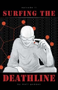
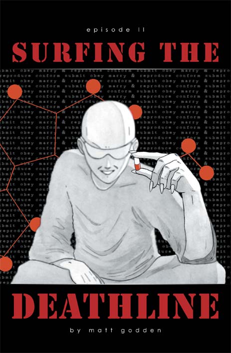 Eddie has arrived at his meeting with The Dealer, and discovers that ideas of friendly customer service aren’t universal.
Philosophical discussions ensue, and the history of The Line is revealed.
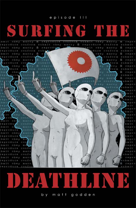
It’s time for Eddie to make his run. Revelations are in store. Horrible, horrible revelations.
40 pages long. Available free to read online (donations accepted – contact me if you want a print version, as I have some limited run stock). For more information, check the Surfing The Deathline site.
Well, here we are with the new version of golgotha.com.au. All database driven, and running in wordpress. This was done as a proof of concept – that I could use a readily available free platform like WP to provide the back end engine and all the post-design editing functions.
While I’m not going all out to do web design as a profession now, on occasion if an interesting project comes along, I’d like to be able to concentrate on the design, and base it on an engine that allows the client to manage the content themselves once my work is done (so I’m not doing 1 paragraph edits for ever afterwards).
It’s been an interesting journey getting this working – interesting in the Chinese sense. The biggest obstacle has been due to a rather nasty rendering bug in Apple’s WebKit rendering engine, which is the basis of the Safari, OmniWeb and iCab browsers. But, eventually I found a workaround, and now all is working well. If you do encounter any problems, please contact me and let me know.
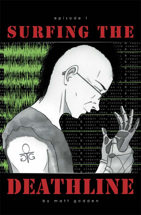 Sometime in the near future, software codemonkey Eddie is down to his last few dollars. Unemployed and living on, or rather under, the streets, he’s also facing “repossession” of his organs to cover student debts.
Now he’s been offered a job, a job that requires he risk his sanity taking an hallucinogen that’ll give him a chance at subverting a Machine Intelligence for a few critical minutes.
It’s called The Deathline, and he has to meet The Dealer to acquire it.
36 pages long. Available free to read online (donations accepted – contact me if you want a print version, as I have some limited run stock). For more information, check the Surfing The Deathline site.
 This poster was produced for the 2007 Sydney Supanova convention. I was a tad uneasy about this one, since it deviated from the thematic elements I’d preferred – angry female characters wielding blunt objects. Still, I’d had a few people asking for images that were less in that direction, a couple specifically asking for some sort of “cyber chick”, and thus, this image. I think this one worked worked really well from a volumetric perspective, and the character has quite a different body type from the other two, far more solid (to my eye, at least).
What I like most about this one is the compositional alignment of the cog with the knees and shoulders.
This image was printed by our new printer and is even more lustrous than the others. Again, it’s a limited run of 50, on 200gsm stock, A3 size and available from the store.
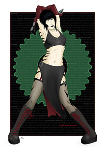
 This is the most popular of the poster images I’ve created, and was done in tandem with Blank for the Sydney Supanova convention in late 2006. The character shown here may or may not make an appearance in the sequel to Surfing The Deathline, Nations.
The initial designs for the character date to 2002 when I was studying animation, during which I created a walk cycle animation of her. During a break from Surfing The Deathline I revived her for a sort of fantasy project, based around the idea of exploring queue rage – hence the name “Cliche”. As I rediscovered my enthusiasm for Surfing The Deathline I shelved the project, but who knows I may still pursue it.
Like Blank, this was a limited printrun of 50, signed and numbered. It’s printed on 200gsm stock, and A3 in size. There’s less than 10 remaining, so if you like it, go visit the store – they tend to sell pretty quickly when I do an event.
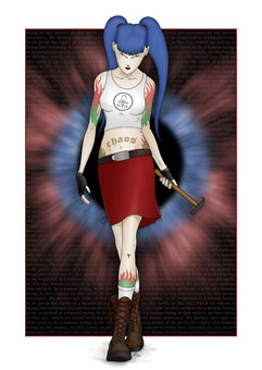
 Everyone loves a girl with a shaven head, boots and a big freaking spanner.
And if you don’t, well, best say you do and avoid a spannering.
This image features the character “Blank” from Surfing The Deathline (free stuff to the first person to correctly identify the origin / reference of her name). I think as an image this is the best of the posters, mainly for the sense of weight and inertia the character carries to one side, balanced by the cog wheel.
Fun fact: the rusty metal surface of the cog is a photo of my coffee table.
The poster of this image is A3 size and printed in full colour on 200gsm stock. It’s a limited signed and numbered printrun of 50 only, and they’re available from the Golgotha store.
