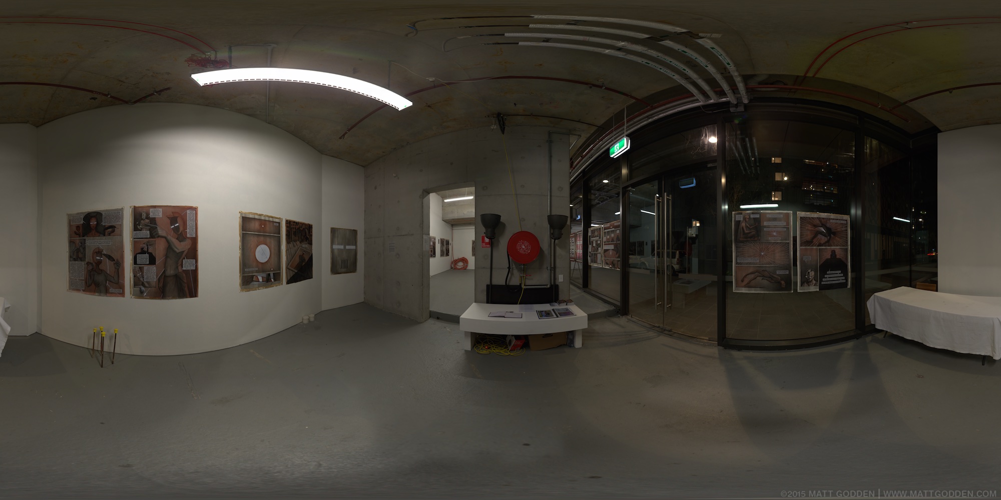
 Supanova Sydney 2006 was the first convention at which I exhibited graphic novels and posters.
Exhibited Works:
- Surfing The Deathline Episode 1
- Surfing The Deathline Episode 2
- Blank
- Cliche
human : artist
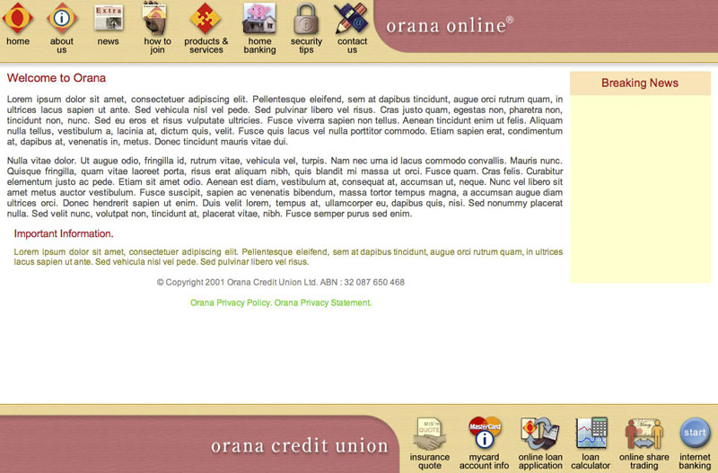 This design was created for Orana Credit Union. Many years later, I still think it’s a beautifully elegant layout, with the vertically and horizontally opposed icons for primary navigation. The bottom ones are all verb enablers, leading to functions, whereas those on the top are for informational division
The entire design scales to any browser size, and the yellow space on the home page was an adjustable post-it note space for quick news pieces etc. It’s a frames based site, which I wouldn’t do these days, but given when the design was done, that was the sanest technology choice.
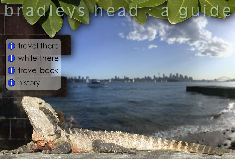 This was a student project from an instructional design class. It uses html, flash, & quicktime to deliver a rich-media tourist guide experience.
Yes, the voiceover is cheesy.
 Zeta Internet’s site. This was designed and built in 1999 / 2000, so the typography is very raw. The site was designed to have space available below the nav section so that advertising could be inserted.