Review: Brydge+ Keyboard

Opening disclaimer: I was provided with a “keeper” review unit by Brydge Keyboards.

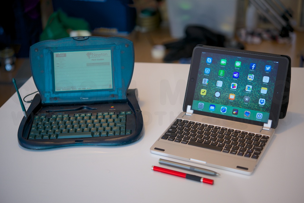
My first laptop style device was an Apple eMate 300 – a NewtonOS based touchscreen laptop. Following that were a couple of generations of PowerBooks, before I moved to Mac Minis as my primary computing platform. However, the memory of the experience of using a touchscreen laptop stuck with me throughout my PowerBook days. While the Windows ecosystem seems to be jumping on the bandwagon of integrating touch into all computers, Apple has remained resolutely against it.

The argument proffered is that fatigue from holding ones arms up to a monitor – “gorillla arms” – makes touchscreens unsuited to desktop computer use, and since Apple’s laptops are desktop computers in a different form factor, no touchscreen for them.

To me, the laptop can be a fundamentally different device to the desktop, insofar as the screen is mere inches from the user’s hands, rather than the full arms length of an iMac or standalone monitor. That should allow for some different ideas about the ergonomics of these devices.

Using an iPad with an external keyboard has been a thing since day one. Apple even launched the iPad with a keyboard dock accessory. Most keyboards are in the form of a folio, or as a slab with a slot to prop the iPad at a specific, set, angle. The Brydge line of keyboards is something quite different – a keyboard with hinges which grip your iPad and make it function in the same way as a standard laptop screen.

The history of the Brydge is an interesting one. Originally started as a Kickstarter project, the company quickly met its funding goals, and moved into production. From here things appear to have become problematic – with customer service not appearing to be able to keep up with sales. Brydge was recently purchased by a trio of Singapore-based Australians, who have embarked on a program of upgrades to sales & customer response systems, and establishing local distribution centres in major markets. For orders in the US, UK or Hong Kong they’re claiming to be able to ship an order within 24 hours of it being placed. They’ve also knocked about a quarter off the prices of the two top models. The unit I’m testing, the Brydge+ With Speakers, has dropped from $199.99 to $149.99, for example. They also have a speaker-less version of the Brydge+ for $139.99 in the brushed aluminium, and $99.99 in polycarbonate.

The Brydge+, like the entire current range, is designed for the second to fourth generation full-size iPads. The hinges on the keyboard have removable rubber linings, which suit the various thicknesses the devices have come in. While it’s not strictly designed for it, you can see in the photos here that an iPad Air in one of Apple’s leather Smart Cases will fit in the iPad 3/4 hinge size. Brydge say they’ve got a new model due out in the 4th quarter of this year, targeting the smaller form factor of the Air.

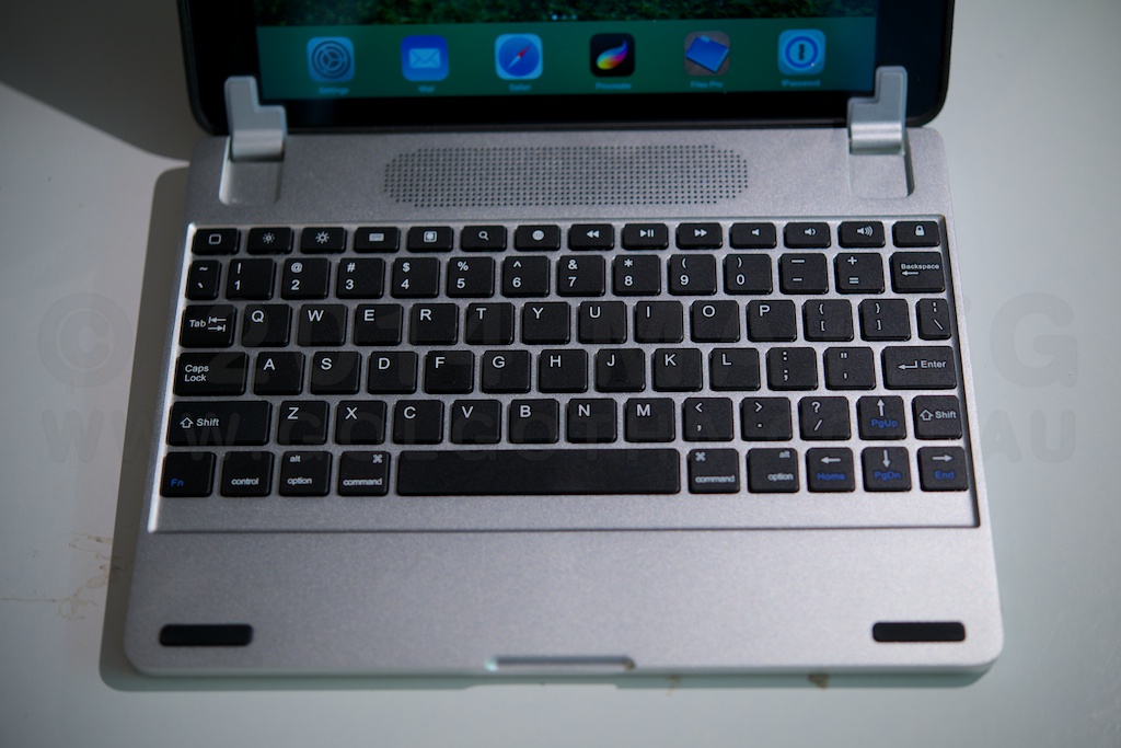
As a keyboard, the Brydge feels identical to Apple’s aluminium bluetooth keyboard in terms of depth of keystroke and “clickyness”, albeit a bit smaller in size. The top row has a number of function keys, including a very handy home key in the top left. One problem with the current models is that one or two of the keys have lost their function due to changes in iOS 7. Unless you need single key access to slideshowing your photo collection, this isn’t likely to be a major concern.

The angle and setup of the hinges is such that as you open the “lid” the screen bezel drops downwards relative to the keyboard surface, much the same as it does in Apple’s MacBook Pro line. As this happens, the angle of the keyboard is raised slightly as the cam-like outer curve of the hinge lifts the whole laptop off the desk. The hinges have a strong enough friction that they can hold the screen at any angle, even all the way back to horizontal, and the keyboard itself has sufficient weight to prevent the whole thing from overbalancing (noting that I’m using an Air, which is significantly lighter than other generations of iPads). What this means, effectively, is that this is a truly lap-top capable “laptop” solution for the iPad. There’s no straps, or kickstands, and the screen doesn’t have to sit a third of the way in to the device. You can have it flat on a desk, or sit in bed with your knees up and rest it on your thighs. Ergonomically, it’s a laptop, without a trackpad you can accidentally bump your thumb on while typing.

This model also has stereo speakers behind a centre aligned grille, which provide a diffferent audio experience to the built in speaker. To my ears they’re not as rich in bass as the Air’s speaker, though if critical audio quality is your thing, you’d probably want a dedicated set of speakers, or some good headphones. The speakers need to be paired separately to the keyboard, however they increase the battery drain.

In terms of battery life, Brydge claims the battery should last “several months” without the speakers in use. Mine arrived sufficiently charged that it hasn’t needed any charging throughout writing this review.

To conclude, the Brydge+ looks like an Apple product, and feels like an Apple product. It’s a top-notch piece of hardware – solidly built from durable materials, and possessed of the sort of heft that inspires a viscerally positive feeling in use. It does exactly what it claims to do – turns the iPad into a highly functional laptop. My personal choice would be the Brydge+ without speakers, although as someone who finds the feeling of brushed aluminium distractingly like touching something that’s electrically live, I’d also strongly consider the polycarbonate version.

If this article was of use, a donation would help support my projects.

March In May

Documentation of the March In May protests in Sydney. The march moved from Belmore Park near central station, to Victoria Park at Broadway. It took more than half an hour for the entire sea of people to move past.

Visiting the Sculpture

So I left home at 5am this morning to make the 45 minute drive out to Campbelltown to photograph my work, and see how it’s faring.

The good news is that it seems to be more or less untouched by the elements. A enveloping cloud of fog greeted me as I arrived, and as the pre-dawn light grew in intensity, it became obvious that the mist was condensing onto the work, running down the surfaces, and dripping off the edges.

It would appear that I have a self-cleaning sculpture.

Another aspect of the morning was that it gave me yet another chance to exercise the Nikon D800, and my not-used-often-enough Gossen Digisky meter. The handheld meter really produces different results to the camera’s metering system, and it takes a lot of getting used to – the camera will generally expose so you can see what you’re metering off, the handheld will give you an accurate measurement of the light, and if it’s dark, your image will be dark.

A guide to EPUB Comics for iBooks

So, based on discussions with a number of local comics people, especially in the wake of the recent ComiXology Amazon buyout, and the brouhaha over the removal of purchase options from ComiXology’s app, I decided to put together a primer on how to build EPUB comic books, like the ones I’m doing, for folks who are interested in getting onto the iBooks platform.

Now, I’ve never used ComiXology, so my opinions / comparisons are somewhat secondhand, but here’s the way iBooks works.


  • You, the creator do all the work authoring the files – Apple doesn’t alter, fix, edit or optimise them.
  • You, the creator set the price – Apple doesn’t discount, give away or in any other way mess with your retail price.
  • You, the creator get 70% of the cover price.
  • You, the creator can build the preview version of your book, and the iBooks reader app will automatically display a “buy & download the full version” link on a blank last page added.
  • You, the creator upload your own choice of example screenshots.
  • iBooks / iTunes store tech support staff are brilliant – super helpful, super keen, and keep you in the loop if there’s a problem that needs to be fixed at Apple’s end.
  • As far as I know, you can pull your book at any time, and it will go off sale (no contracts granting Apple x-number of years of sales), though those who’ve bought it already will continue to be able to download it.
  • You get to choose if your book has DRM or not. Personally, I do put DRM on my files, because it ensures the reading experience is the one I created (given I use a lot of WebKit specific design and scripting) – locking the reader to iBooks on a Mac or iPad. Non-DRMed files are still watermarked to the buyer’s iTunes store account.

With comics, you’re producing what’s called a “fixed layout EPUB”, which in the iBooks reader app means your page art is edge to edge, and the controls are displayed differently. The authoring tools necessary are a text editor, and any image editing apps you already use.

A Fixed Layout EPUB is basically a website. Each page of your book is a separate webpage, with content entered using HTML, and CSS to define how everything looks. You define the size of the viewport to be the size of your page, and then you can use positioning values to place things exactly where you want them.

It’s web design, without the ambiguities of working with multiple browser engines / window sizes etc. Better yet, becuase it’s a walled garden of WebKit, you can use lots of WebKit specific CSS that hasn’t been ratified as part of CSS3 yet.

The Merchant Process

In order to sell books on iBooks you have to do the following:

  • Obtain a US Tax ID.
    • One option is to get an ITIN – this is long and expensive, requiring sending a passport to the US consulate for ID verification, plus document fees.
    • The second option is quick and cheap – call the IRS in America and get an EIN, as documented here. This takes about 2 weeks for everything to work its way through so that your EIN is recognised by Apple’s systems.
    • NOTE: income earned via the iTunes / iBooks store is taxed in America at (from memory) a 30% rate, which you can then claim back from the Australian Tax Office as a credit under international treaties against double-taxation.
  • Sign up for an iTunes Merchant account to sell on the iBooks store.
    • Free accounts can offer only free books, but don’t require you giving Apple banking & US Tax information.
    • Paid accounts require you to give Apple your bank details (so they can pay you your residuals), and the aforementioned US Tax information, buy you don’t have to pay for the account itself
  • (Depreciated – this program has now closed, and book authoring doesn’t require a dev account) Sign Up for an Apple Developer account so you can download tools and access the developer support forums. The type of account you need is the Safari Developer Program – it’s free, and gives you write access to all the forums which are to do with iBooks, and WebKit. You can read all the other forums. Needless to say, these are all NDA covered.
  • Upload your file, excerpt, screenshots and metadata (pricing, territories etc) using iTunes Producer. iTP will preflight your files, identify any problems, like code bugs, and tell you what they are so you can fix them.
  • Initial approval usually takes about 10 working days, and updates take around the same amount of time.

The Authoring Process

My first recommendation is to read the lessons on R. Scott John’s blog, starting with:

…and ending with part 7.

Then read:

That should give you all the information you need to get the basic thing up and running. Some additional tips:

  • iBooks on the Mac allows you to direct load your EPUB working files to the iPad for preview and debug.
  • iBooks Author doesn’t currently do paginated books, with zoomable art.

Any questions, hit me up in the comments. Oh and one final thing – if this is of use, go buy a copy of The Metaning on iTunes. Researching & collecting all this information together took most of my time over a couple of weeks, and there’s a lot of garbage information out there, or information that’s only available via paid sources – the “buy my ebook on how to make ebooks” type thing. Getting a few book sales would be a nice payback.

If this article was of use, a donation would help support my projects.

Review: Adonit Jot Touch 4

Opening disclaimer: I have previously purchased a Jot Touch 4, and an original Jot Touch. The first generation model has unfortunately been made obsolete by changes in iOS 7, and so I was provided with a “keeper” review unit by Adonit, and Mobile Zap Australia, as a replacement.

As an artist, and one of them “Readers”, my kit for whenever I was out of the house day to day usually contained the following:

  • A4 Sketchbook.
  • Blue lead mechanical pencil.
  • Graphite mechanical pencil.
  • Eraser.
  • Paperbook novel.

When the iPad came into my life, I had the chance to consolidate, and the linchpin for all of this, and indeed the one missing part of the iPad puzzle that allowed me to adopt the platform, was the Jot Touch 4.

The Jot Touch is an iPad stylus which, uniquely when it debuted, provides pressure-sensitivity much like that of a Wacom tablet. It’s a genius solution to the problem of iPads not actually being pressure sensitive – the iPad natively tracks the location of the touch from the stylus tip, and the pressure information is measured in the pen, then communicated in realtime over Bluetooth.

To get the benefit of this, one needs a Jot enabled app, and my weapon of choice at the moment is ProCreate. If you click on the image above, what you’re seeing is a single tool – the 6b pencil, with no adjustments made during the entire drawing session. Everything there comes from the range of pressure available in the pen. It’s been a while since I did any repetitive drawing exercises , but the range of thin and thick strokes, variations from thin to thick and back, and ability of the pen to reliably keep up with my fast scribble drawing style mean that this tool is in every way a capable replacement for analog drawing implements.

Now, obviously a question that’s going to arise is what it’s like compared to an actual Wacom tablet. Adonit list the pen as recognising 2048 levels of pressure, much the same as the current desktop Wacom technology, and possibly more than many of the “Wacom enabled” tablet devices out there. For me, however it comes down to this – how good is your muscular control, that you could be that subtle in pressing on a pen? You can see some jitteryness and straight bits in loops in the image above – that’s entirely down to me and my less than rock-steady hands.

In terms of the hardware itself, The construction quality is utterly sublime. The stylus has a cylindrical aluminium barrel in charcoal or a deep lustrous red, and a rubber coated grip area with two buttons that can be mapped to control various functions. Between the buttons is a status LED, which glows red while charging, and green to indicate switch on, or charged. The cap screws off, and can be screwed onto the base when in use. Under the cap is the nib itself – a biro-fine metal tip ending in a clear plastic disc attached in the middle with a ball & socket joint.

This combination takes a moment of acclimation, and a bit of care when the lid is off. Once you start using it however, the ingenuity of the solution becomes apparent. The iPad has a minimum touch target size – around 5mm in diameter, and this has resulted in most styli being fat crayons, whose tip thickness obscures the point at which marks are made. The Jot’s clear disc, and fine metal tip mean that you can clearly see where your pen mark is happening, at least as clearly as you would with any analog drawing implement. In ProCreate, I have the brush outline switched on, and it’s clearly visible through the disc. So, you get direct visual feedback of how the pressure you’re applying translates into brush size – assuming that’s the dynamic you’ve got enabled.

This brings up an important point – because the iPad has a hard, flat, glass screen, and the Jot Touch has a hard, flat, plastic tip, a small bit of grit could potentially get caught between them. If you’re pushing down on the pen, there’s a risk of scratching your iPad’s glass. My recommendation is to carry a micro-fibre cloth, and then clean both the iPad, and the pen tip before each drawing session. Another option might be to try a screen protector if the cleaning solution is unworkable.

Back to the stylus’ construction, possibly one of the nicest features is the recharging setup. The end of the pen latches into a usb recharging dock which is about the size of a tiny USB thumb drive. It’s held in by magnets, strong magnets, which support the pen securely regardless of orientation – mine hangs in space parallel to the floor, the charger plugged into the usb port in the side of one of my displays.  The magnets also make docking the stylus automatic – get the end of the stylus close enough, and it will auto-align and pull into place.

The battery lasts long enough that I’ve never even come close to wearing it out – Adonit claims a month of “nomal use”. Like most of my devices, I plug it in each night, but you can happily leave the Jot in a bag for days without worrying about lacking power. I’m a big fan of built in batteries – the idea of having to use something like AAA batteries for a device is one of my pet peeves, so the Jot’s power setup really is a brilliant solution.

I’d like to close with a comparison – last week I received a Wacom Airbrush stylus, which I was intending to use to replace my broken Intuos4 XL Grip pen. It costs basically the same as the Jot Touch, and while it has a different featureset, in terms of build quality I think it’s reasonable to compare them. The Wacom pen is back with the distributor for exchange because all of the internals were so poorly fitted to the case that pressing the eraser in made the tip move out. It also felt fragile, hollow, squeezable under grip pressure, and cheap. The Jot Touch is utterly unlike that which we put up with from Wacom. It’s a true masterpiece of solid, functional, spare, Modernist industrial design, and a standard to which all objects one holds in one’s hand, should aspire.

If this article was of use, a donation would help support my projects.

The Other Wrist

Occasionally, I like to engage in a bit of recreational tech prognostication, and with the current hubbub over what Apple will do next, it seems there’s a considerable slice of the world who thinks the next big thing is a “smart” watch.

This is dumb.

Brutally dumb.

Apple, in its current aesthetic is a premium product company. If they are going to make a product, it will feel like the most materially luxurious version of that product. Hence the metal and glass design language they’ve adopted over the past few years.

Here’s the thing, most people don’t wear watches any more. They’ve become an enthusiast device, and the premium end of the market is mechanical. Mechanical to the point of fetishising that very nature, so that whole new classes of designs and movements are being invented, creating even more baroque ways to enable accurate progression via purely mechanical means. The joy of the modern watch is to wear a mechanical engine on your wrist.

That leaves the other wrist. Whatever Apple is working on, will be something you’d keep on your wrist while NOT wearing a watch. It will not be a portal to your phone, it will probably not have a screen at all. My bet, it’s going to be a motion recorder, like fitbit, which allows you to log and stream all your movement for interactivity like a wiimote.

More importantly, it also acts as a wearable passcode key for all your devices. Your mac unlocks when you approach, and locks again when you leave, your phone and tablet unlock when you pick them up, and it talks to iBeacon-using smart house devices (ie those who will fill the void left by NEST becoming a pariah for joining Google) around your house for smart house integration. iBeacon will be the new feature for home environment and control devices, the way AirPrint became a must-have for printers. It’ll be waterproof, and charge inductively.

There is no “how do I tell the time on my wrist” problem to be solved. There is no “how do I get a small music player for while I’m exercising” problem to be solved. There is no “I want to see my email but not take my phone out of my pocket” problem to solve, no actual people think like that. All the “problems” current smart watches “solve” were invented post-hoc purely to justify the concept of the “smart watch”.

Whatever it is, it won’t solve a glaring problem you, or anyone else thinks you have. It will solve problems that were so constant, so low level so much a part of the background friction of your life, that you never recognised them for what they were.

Update March 10th:

Here’s an article on an Apple patent for for doing one of the things I mentioned.

Review: “kit: Bluetooth Keyboard Case”

Opening disclaimer: I was supplied with the test unit by MobileZap Australia, and allowed to keep it.

The Kit: Bluetooth Keyboard Case is a leather folio style tablet case designed to fit full sized tablets in the 9-10 inch range. It does so by having plastic clips which grip around the corners of the tablet, are connected to the case with elastic, and can therefore stretch outwards, accommodating larger form factors. In this case, I’m testing with an iPad Air, which unfortunately is too thin on its own for the clips to grip securely. You might want to look for a specific iPad Air case if you want to use that particular tablet. Alternatively, if you have one of Apple’s smart cases around your Air, I’m using the black leather one myself, it will bulk it out sufficiently for the clips to maintain a firm grip on the device, and the cover flap can close over your screen before you fold the keyboard against it.

The construction seems very sturdy, being stitched leather, with a soft suede-feel inside. The back of the case has a magnetically secured kickstand to prop the screen up while open, and the whole thing is kept closed by a leather flap and loop arrangement, which seems secure enough.

The keyboard itself is removable from the case, and held in with magnets, which makes it convenient to keep the single sheet instructions underneath. It can be removed and used without the folio, as the battery is within keyboard itself. It’s a reasonable keyboard, featuring about 5mm of travel and a full row of function keys. My only real criticism of it, coming from a Mac background, is that the right shift key is too small for the way I type (right pinkie finger used to activate shift). Given a perfect world, I would have preferred a smaller single line enter key, and a relocation & resizing of the End & right Control keys, respectively. That said, the keyboard is very usable, and I was able to comfortably code up a website while on the road. This is probably the biggest blessing of an external keyboard for someone like me, who actually really likes typing on the screen – the on-screen keyboard eats half the display, which is problematic when doing extended writing / coding sessions. I’m writing this review on the keyboard, and having the full screen to read back and ahead is so much better for keeping the context of the bit you’re writing at that moment in your head.

In terms of battery life, I haven’t been able to determine how long it lasts – though my habit with electronic devices is to charge them every night, I’ve been using this keyboard sporadically since December 18, and it’s still working on its initial charge. The manual lists 80 days standby, and 90 hours use. Charging is an area where I have a criticism of this product, however. Although the single sheet user manual states the product comes with a charger cable, my particular example didn’t include one. Thankfully I was able to find a charger for a bluetooth headset that happened to have the required micro-usb connector. Pairing and activating the keyboard is easy, with a built in key combo to wake the connection up after it’s been switched off.

All in all this is an effective and reasonably priced solution, which has a distinct advantage of not being tied to any particular model of tablet. If you’re in a situation where you want to provide standardised keyboard covers for multiple types of tablet, or have multiple tablets, but only want a single keyboard cover, this may be something to have a look at.

If this article was of use, a donation would help support my projects.

A Mountain Lion Calendar Reminders Solution

So there’s this bug in the calendar app in Mac OS X 10.8 Mountain Lion, where even though the reminders preferences are set to “None”, when you create new events they’ll show a reminder for the day before at 9am.

Having gone quietly mad trying to figure out the problem (there seem to be several solutions listed online relating to editing .plist files, none of which work), the situation and solution is thus:

When Calendar.app is started up afresh, there are 3(4) calendars in it:

  • Home
  • Work
  • Birthdays
  • (Reminders)

These have no reminders set in them, however any new calendars created will have the 9am day before default for any events created even if the preferences are set to none.

The solution is to create any new calendars, then create a new event, and open the inspector to you can see the event’s properties. Open the preferences, and toggle the reminders from none, to one of the other options and close preferences. Then open it again, toggle the reminders setting back to none, and close preferences again.

Problem solved.

If this article was of use, a donation would help support my projects.