This entry was an article I wrote, which was published in the NSW Writers’ Centre magazine “Newswrite”.
Neil Gaiman’s groundbreaking Graphic Novel series The Sandman fills approximately eight inches of my bookshelf. The final major volume, The Wake, is a funeral for the main character, Dream. Characters from throughout the series are drawn to it, to make their eulogies.
In my life, I have attended three funerals. Two for grandparents, and one for a high school friend, murdered in the October 12 2002 Bali bombings.
I did not shed a tear at any of them.
The Wake is a book I read on my own, such is the unmanliness of the weeping it elicits from me.
Why is this? I grieve so utterly over this fictional character, that I feel his passing more profoundly than I have any real person.
We could of course argue that Neil Gaiman is a great writer, and that there’s something wrong with the way my head works. Both of these may be true. Since I’ve never had this strength of feeling while reading prose, I think there’s something important at play here, something about the nature of the graphic novel as a medium that writers should investigate.
That thing, I believe, is the function of empathy and sympathy, as communicated through body language and facial expressions. The ability to read, and share emotional experiences, and to communicate with strength and subtlety at a mere glance, derives from the degree to which these forms of communication are instinctive, or rather, processed at a subconscious level.
In writing Surfing The Deathline, I presented myself a challenge – a story told graphically, yet relatively lacking physical action, the traditional fare of comics. Without descriptive or internal narrative, I had to rely wholly on the physical “acting” of my characters to convey every emotional cue I wished to invoke in the reader.
For the graphic novelist, this narrative limitation can be a powerful tool. We can use body language and facial expressions to reach straight into the reader and wrench their emotions, bypassing the logical and contemplative higher brain functions. Once readers empathise with our characters, they are open to sympathise with our message.
Surfing The Deathline is a political and social commentary, just as H.G. Wells’ War Of The Worlds was an indictment of the British Empire’s treatment of native peoples. Hopefully, as a result, readers will be prompted to think about and question some of the directions in which our society is heading.
The themes I’m attempting to tackle are poverty, isolation, terrorism, geo-political power, oppressive government, suppressive media, the war on drugs, anti-ethical morality, machine intelligence and human obsolescence.
Thankfully, one of the strengths of Science Fiction has been to facilitate placing social commentary in a format that appeals to the masses. Good sci-fi always creates a universe dense enough that it has an interest for readers beyond the characters. I like to think of this world-building as the result of combining three basic paradigms; geo-political, technological and sociological. A world, a disruptive key technology, and the effects on the general populace.
In Surfing The Deathline, after losing a network war with a trading block comprised of the third world, the USA is sundered into three nations, one of which is a fundamentalist Christian theocracy. Europe, though racked with internal conflict, is again the ascendant power. The dominant technology is Machine Intelligence (M.I.), ranging from toasters that don’t burn bread, cars, automated factories and surgical expert systems, to the vast self-aware intelligences that are the broodstock for more mundane functional versions. Nowhere in any of this, are there humanoid robots. Socially, the trains run on time and have pro-government news reports screening in the carriages. Universities expel students if their research harms the reputation of their corporate sponsors, and sell student debts to collection agencies. Welfare payments are tied to tracking implants which exercise moral control over discretionary spending. Beer commercials screen next to news stories about harsher anti-drug laws and forced chemical detoxification for those caught using. The latest drug scourge is The Deathline, a mental accelerant. It’s considered an unfair advantage in the workplace. One of its side effects is that it can kill.
Unstable superpowers, uncontrolled technology, hypocritical leaders. Pretty farfetched, huh?
The story is about Eddie. He’s a homeless unemployed former M.I. researcher, kept out of work by a no-compete employment contract, who gets an opportunity to clear his student debts with a shady network cracking job. He has to go meet a dealer to score The Deathline in order to have a chance of success. They have a drug guru type chat about the nature of life, then Eddie returns to his campsite in the disused stormwater drains. Eddie takes the drug, and begins the job, in the course of which he discovers the awful truth about the disastrous events of his life.
The series of conversations that make up a large part of the key story events ran the risk of being a dull set of talking heads, the action finale being Eddie alone inside an enclosed hammock. Expressive physical acting, utilising hand gestures and facial expressions, was my solution.
Feedback has been overwhelmingly positive, with the books nominated in every local category of the Ledger Awards. Readers have commented specifically about their surprise and delight that in a visual medium, they were highly engaged by scenes of conversation.
These wonderful tools of physical communication are hard-coded into every reader, and they’re awaiting your characters’ performance.
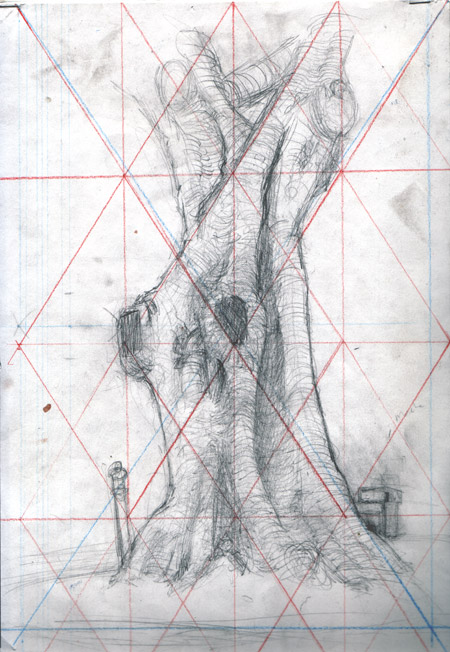
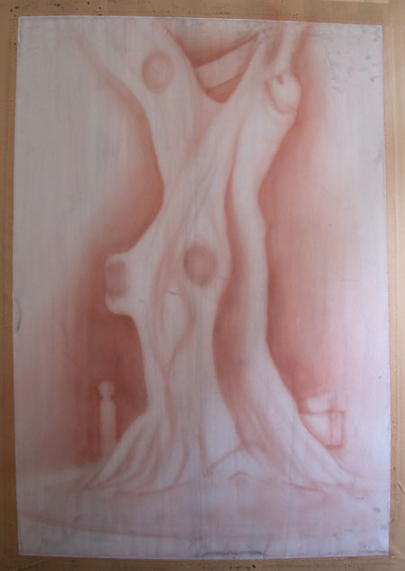
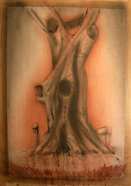
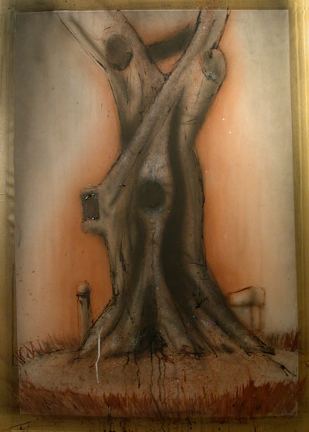
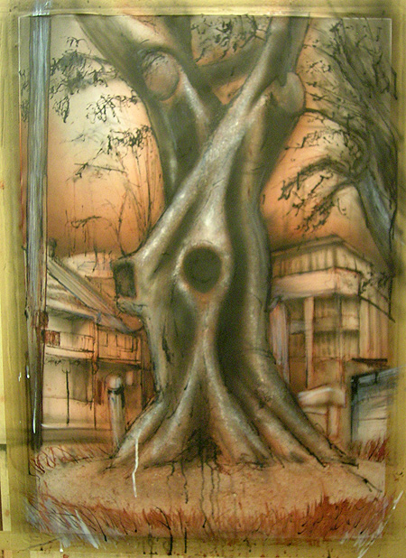
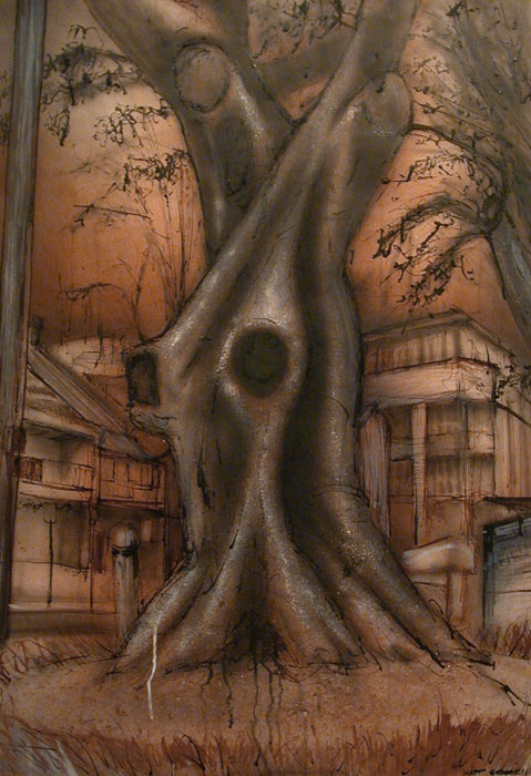 Well, this was my personal apocalypse piece for the year. Done in the same drawing subject as the St Mary’s piece, I obsessed over this work from the time I woke, until I fell asleep. What I wanted to get to was the, well, horror and revulsion these trees evoke, combined with the overt sexuality of their forms. I imagined (yeah imagined *cough* – hey look over there) what they must be like to someone under the influence of any number of substances, illicit or otherwise, and tried to conjure up this screaming, commanding monster of a deity, all demanding, and all consuming. It helps to keep in mind the park this tree occupies is frequented by junkies.