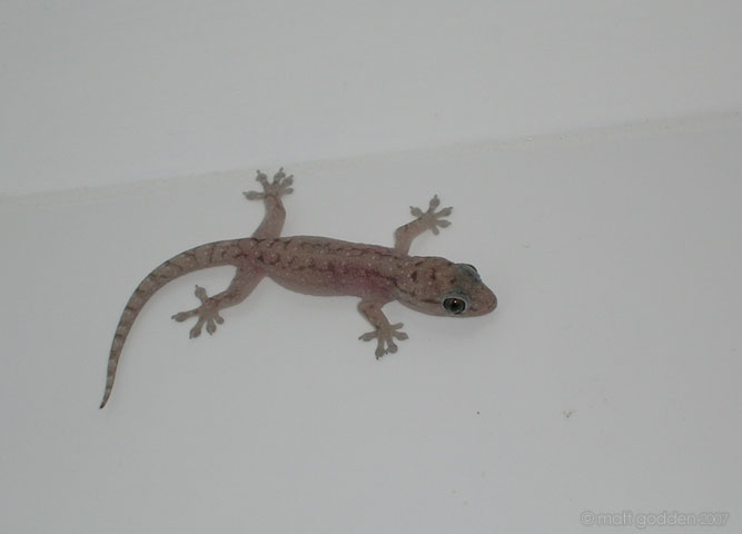
 One of the funny things about Queensland is the suburban wildlife. At noosa for example, you have scrub turkeys (imagine a normal turkey, basically a wild version) wandering around the main street in the mornings. The other thing is geckos. Little, tiny, semi-translucent geckos.
further down the river
![]() Here we have a full 180 degrees of the same river from a different location.
Here we have a full 180 degrees of the same river from a different location.
I love the colour saturation in these images.
a rural river
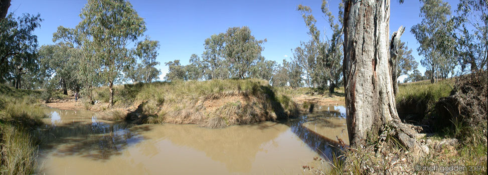 My father used to own a small farm property, and it had a river running through it. This was when rivers tended to have at least some water in them.
What I really like about this image is the tree in the foreground as compared to the background. From memory this is only a 90 degree field of view.
glebe point waterfront
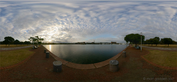 This is, or at least was one of my favourite fishing locations, but they changed the lighting, so the water isn’t as well illuminated at night. As a result this wonderful location, such a short drive from home has more or less shut down.
Still, it’s a pretty picture. It’s also one of the most polluted places in Sydney, the sediments being filled with all sorts of crap from a hundred years worth of industrial use.
enmore design centre
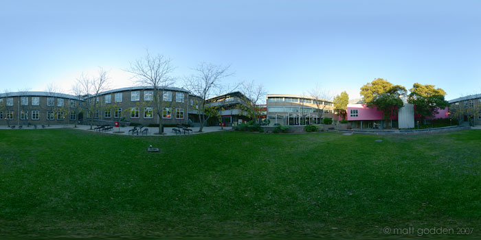 This is the design college I was studying and working at for a while. It’s right down the bottom of the street I was living on at the time. Which was convenient to say the least.
trees of newtown cemetery
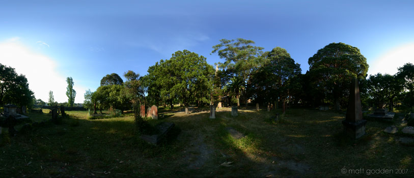 One great thing about these old cemeteries, they can often represent the last remaining areas of tree cover in densely populated inner city suburbs.
This is a nice vista of the whole area inside the graveyard walls.
a graveyard corner
 This is an early attempt at a high dynamic range image. It’s a bit difficult to make out, but the location of the image is in the back of a very tight corner at one edge of the graveyard.
See all those headstones against the wall. Oh yes “You son of a bitch. You moved the cemetery, but you left the bodies, didn’t you? You son of a bitch, you left the bodies and you only moved the head stones. You only moved the head stones. Why? Why?”.
trees and graves
 Unfortunately I only shot one set of exposures for this, and no nadir frame.
I may have to reshoot it to get a high dynamic range image, but that will be difficult given the tendency of trees to move in the slightest breeze. either way, it’s a nice image as it is.
st. stephen’s church
 One of Newtown’s most loved locations is St Stephens church and cemetery.
Apparently the final resting place to a number of (in)famous individuals, it’s overgrown nature makes it a picnic and photography favourite.
cloudlands house
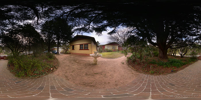 Cloudlands house is a place you can rent in the blue mountains west of Sydney. It may look like a simple weatherboard cottage, but once you’re inside it’s all dark wood panelling, fireplaces and big clawfoot baths.